 |
||||||||||||||||
|
|||||
|
|
||||
|
 |
|
|||
|
|||||
|
|||||
|
|||||
 |
 |
|||||||||||
 |
 |
|||||||||||
 |
||||||||||||
 |
||||||||||||
 |
||||||||||||
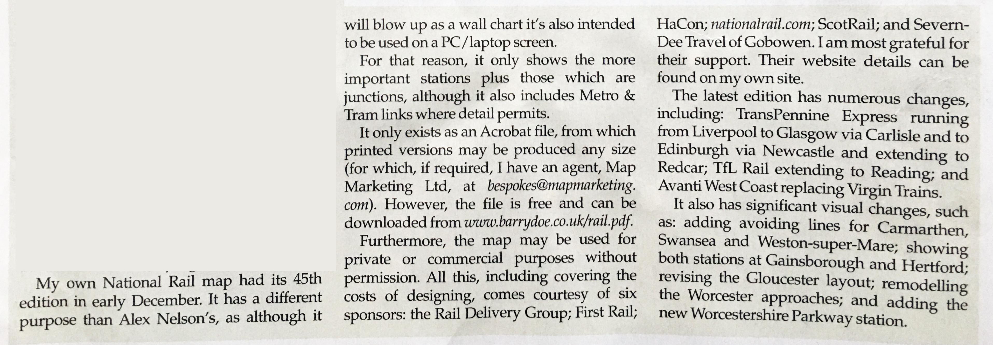
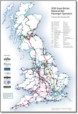
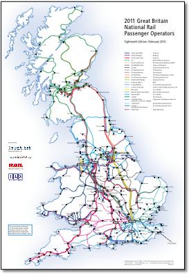
For 'significant visual changes' read 'corrections of previous poor cartography'. For example Gloucester was previously shown incorrectly. |
||||||||||||
 |
 |
 |
 |
|||||||||
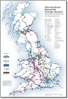
Now with Corfe Castle |
Shows West Midlands Trains but not its two brands West Midlands Railway and London Northwestern Railway |
|||
 |
 |
 |
 |
|||||||||
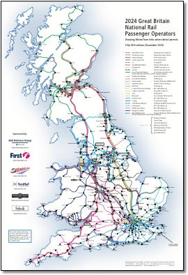
Now with 'added Tube/Metro & Tram services where detail permits'. The map now has very thin spidery lines around London, Sheffield, Manchester, Newcastle, Blackpool but not Edinburgh or Birmingham. So Epping but no Warrington or Wigan. New Addington but no Bristol Parkway or Lincoln. |
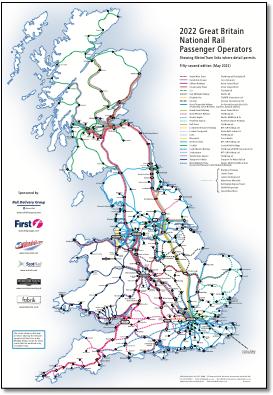
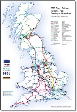
23rd edition Trying to come up with 23 different colour codes for the TOCs was obviously difficult and so colours are used more than once in different line styles. As a result, the dashed line styles make the operator look less important than other lines (possibly looking like a weekend only or limited service - ie East Coast looks like a poor relation to Grand Central). It might have looked better if the main inter-city operators were given continuous lines. Not all lines are shown, for example there's quite a bit missing around Hamilton, Motherwell and Falkirk. Captions are sometimes poorly place (see for example Newhaven and Seaford; Lichfield Trent Valley would be better as just Lichfield placed above). Pier Head Ryde should be Ryde Pier Head. Blackpool not properly captioned - no room for a complete list here. Station reversal is inconsistent (Swansea but not Camarthen). Station selection misses out some important places even when there’s plenty of room (Chepstow, Welshpool, Bristol Parkway, Sleaford, Durham, Burnley, Yeovil, Gainsborough etc) and we have Barton-on-Humber but no Stockport, Warrington or Wigan, and why two stations at Harwich and Aylesbury? It might give a general idea of where the TOCs operate but there is no detail in London, Manchester, Glasgow, Birmingham or Liverpool. |
|||
 |
 |
|||||||||||
 |
||||||||||||
 |
||||||||||||
 |
 |
|||||||||||
 |
||||||||||||
 |
||||||||||||