 |
||||||||||||||||
|
|||||
|
|
||||
|
 |
|
|||
|
|||||
|
|||||
|
|||||
 |
 |
||||||||||||
 |
|||||||||||||
 |
 |
||||||||||||
 |
|||||||||||||
 |
 |
 |
|||||||||||||||||||||
 |
|||||||||||||||||||||||
 |
|||||||||||||||||||||||
 |
|||||||||||||||||||||||
 |
|||||||||||||||||||||||
 |
|||||||||||||||||||||||
 |
|||||||||||||||||||||||
 |
 |
|||||||||||||||||||||||||||||||||||||
 |
||||||||||||||||||||||||||||||||||||||
 |
 |
|||||||||||||||||||||||||||||||||||||
 |
||||||||||||||||||||||||||||||||||||||
 |
||||||||||||||||||||||||||||||||||||||
 |
||||||||||||||||||||||||||||||||||||||
 |
||||||||||||||||||||||||||||||||||||||
 |
||||||||||||||||||||||||||||||||||||||
 |
||||||||||||||||||||||||||||||||||||||
 |
||||||||||||||||||||||||||||||||||||||
 |
||||||||||||||||||||||||||||||||||||||
 |
||||||||||||||||||||||||||||||||||||||
 |
||||||||||||||||||||||||||||||||||||||
 |
||||||||||||||||||||||||||||||||||||||
 |
||||||||||||||||||||||||||||||||||||||
 |
||||||||||||||||||||||||||||||||||||||
 |
||||||||||||||||||||||||||||||||||||||
 |
||||||||||||||||||||||||||||||||||||||
 |
||||||||||||||||||||||||||||||||||||||
 |
||||||||||||||||||||||||||||||||||||||
 |
||||||||||||||||||||||||||||||||||||||
 |
||||||||||||||||||||||||||||||||||||||
 |
||||||||||||||||||||||||||||||||||||||
 |
||||||||||||||||||||||||||||||||||||||
 |
||||||||||||||||||||||||||||||||||||||||
 |
||||||||||||||||||||||||||||||||||||||||
 |
||||||||||||||||||||||||||||||||||||||||
 |
||||||||||||||||||||||||||||||||||||||||
 |
||||||||||||||||||||||||||||||||||||||||
 |
||||||||||||||||||||||||||||||||||||||||
 |
||||||||||||||||||||||||||||||||||||||||
 |
||||||||||||||||||||||||||||||||||||||||
 |
||||||||||||||||||||||||||||||||||||||||
 |
||||||||||||||||||||||||||||||||||||||||
 |
||||||||||||||||||||||||||||||||||||||||
 |
||||||||||||||||||||||||||||||||||||||||
 |
 |
|||||||||||||||||||||||||||||||||||||||
 |
||||||||||||||||||||||||||||||||||||||||
 |
 |
|||||||||||||||||||||||||||||||||||||||
1.jpg) |
||||||||||||||||||||||||||||||||||||||||
 |
||||||||||||||||||||||||||||||||||||||||
 |
||||||||||||||||||||||||||||||||||||||||
 |
||||||||||||||||||||||||||||||||||||||||
 |
||||||||||||||||||||||||||||||||||||||||
 |
||||||||||||||||||||||||||||||||||||||||
 |
||||||||||||||||||||||||||||||||||||||||
 |
||||||||||||||||||||||||||||||||||||||||
 |
||||||||||||||||||||||||||||||||||||||||
 |
||||||||||||||||||||||||||||||||||||||||
 |
||||||||||||||||||||||||||||||||||||||||
 |
||||||||||||||||||||||||||||||||||||||||
 |
||||||||||||||||||||||||||||||||||||||||
 |
||||||||||||||||||||||||||||||||||||||||
 |
||||||||||||||||||||||||||||||||||||||||
 |
||||||||||||||||||||||||||||||||||||||||
 |
||||||||||||||||||||||||||||||||||||||||
 |
||||||||||||||||||||||||||||||||||||||||
 |
||||||||||||||||||||||||||||||||||||||||
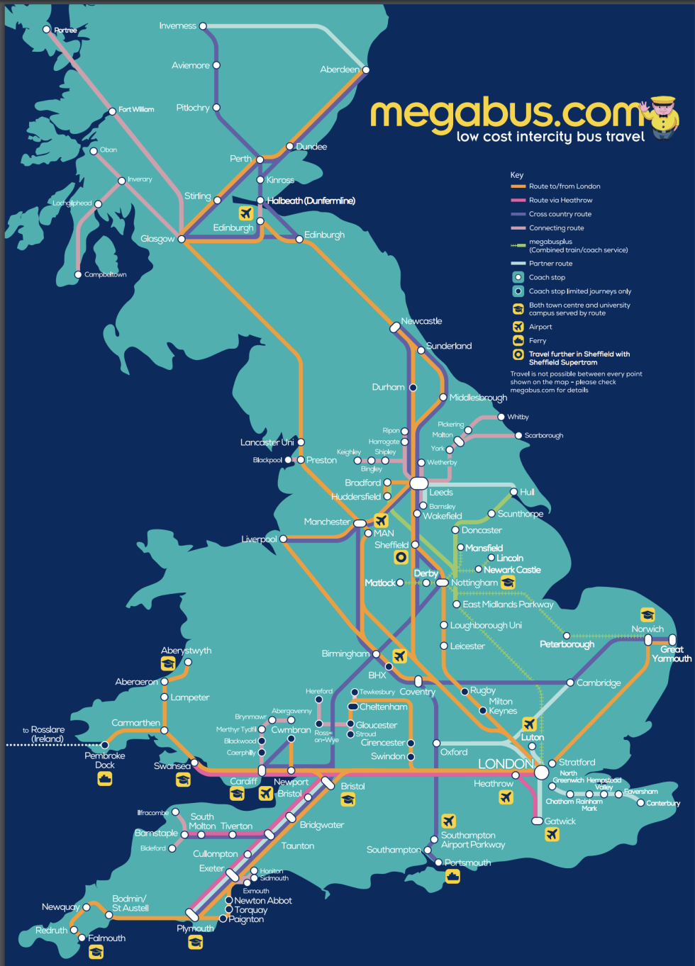
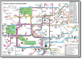
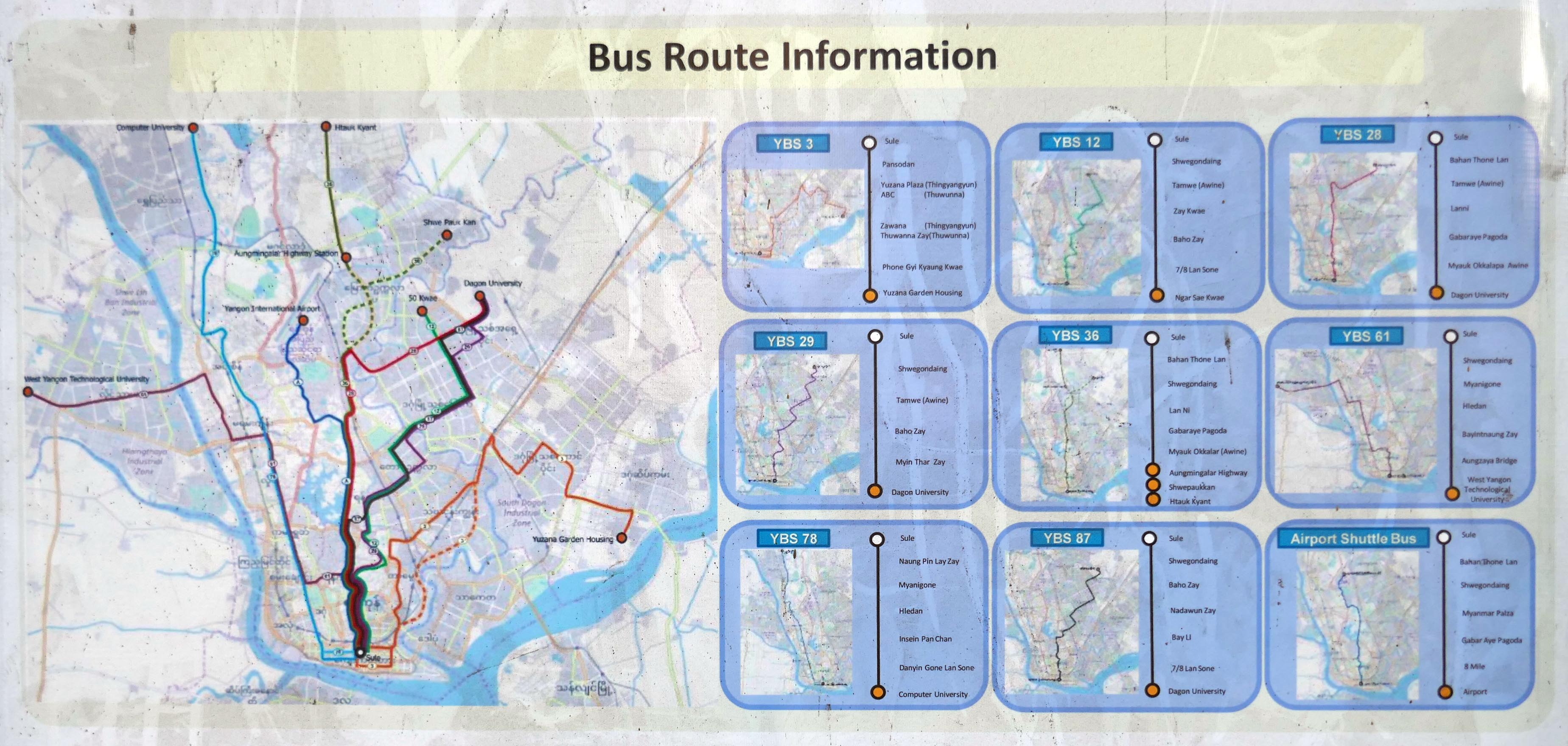
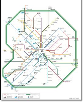
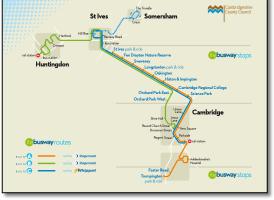
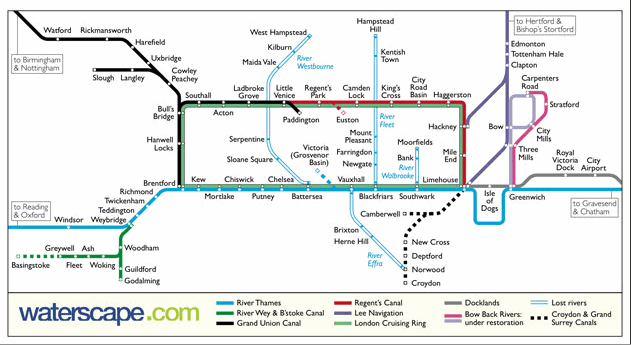
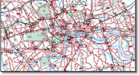
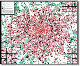
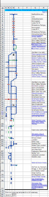
See www.busmap.co.uk for full versions. |
||||||||||||||||||||||||||||||||||||||||
 |
||||||||||||||||||||||||||||||||||||||||
 |
||||||||||||||||||||||||||||||||||||||||
 |
||||||||||||||||||||||||||||||||||||||||
 |
||||||||||||||||||||||||||||||||||||||||
 |
||||||||||||||||||||||||||||||||||||||||
 |
||||||||||||||||||||||||||||||||||||||||
 |
||||||||||||||||||||||||||||||||||||||||
 |
||||||||||||||||||||||||||||||||||||||||
 |
||||||||||||||||||||||||||||||||||||||||
 |
||||||||||||||||||||||||||||||||||||||||
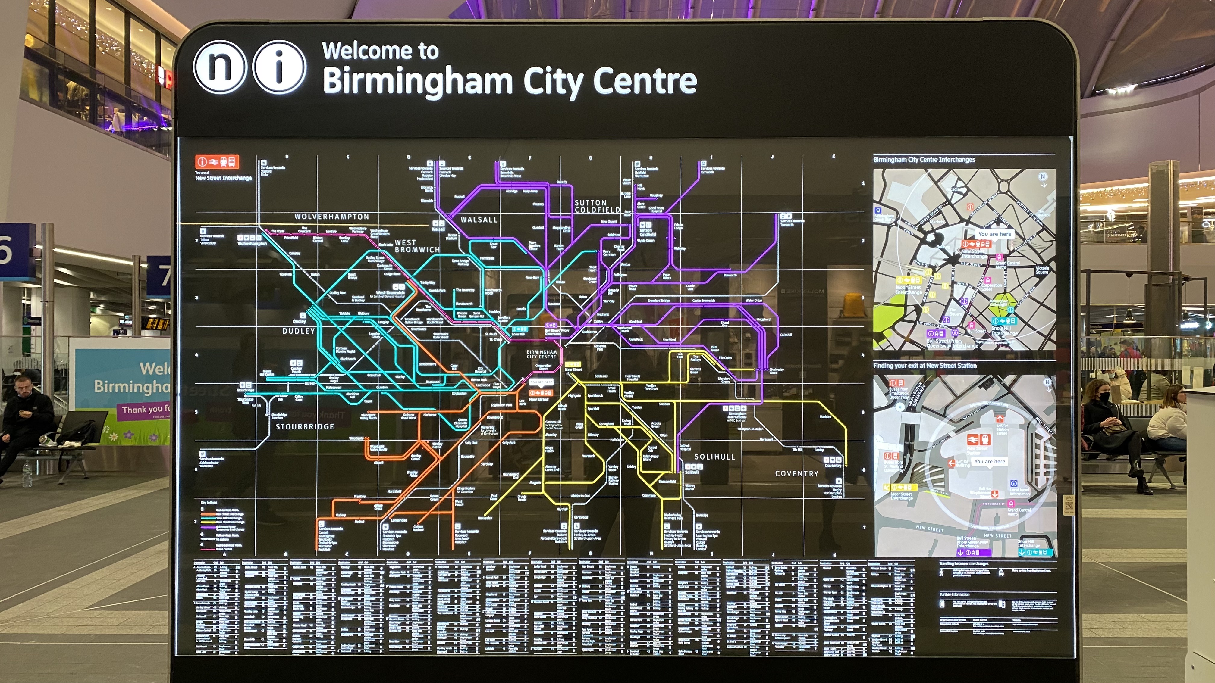
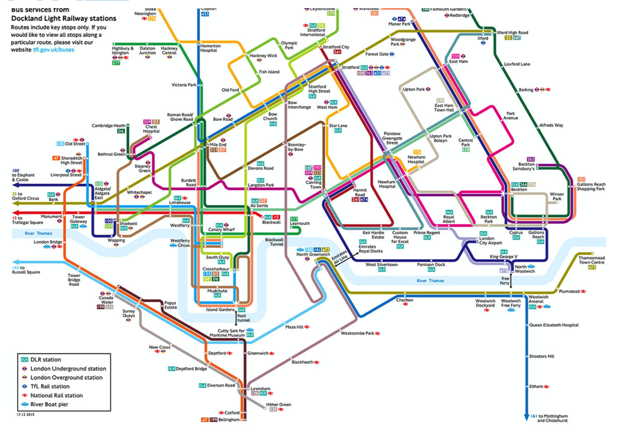
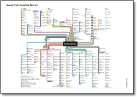
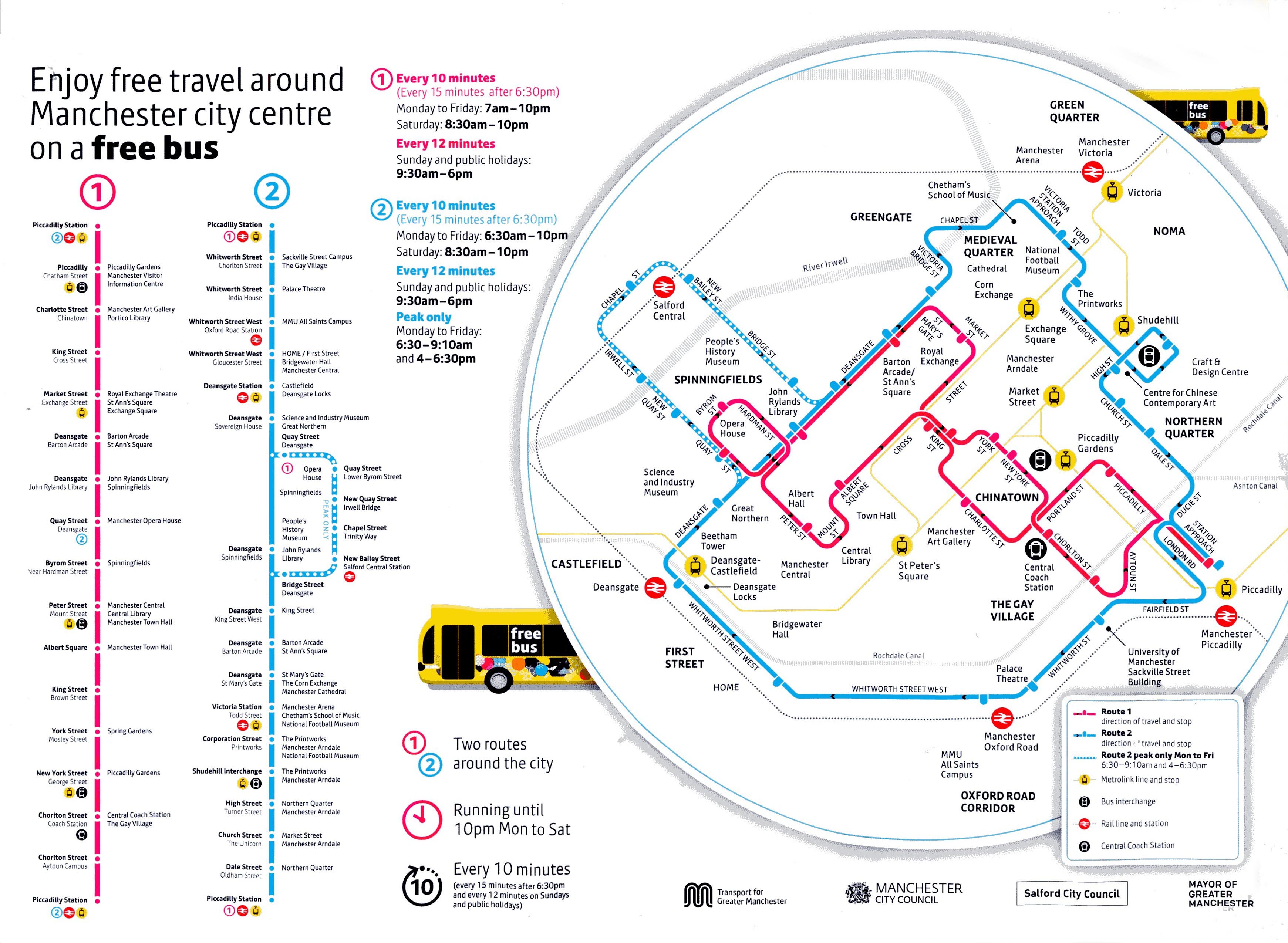
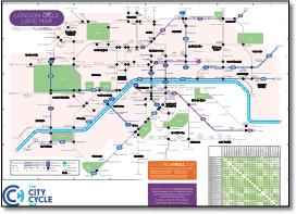
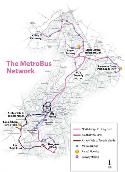
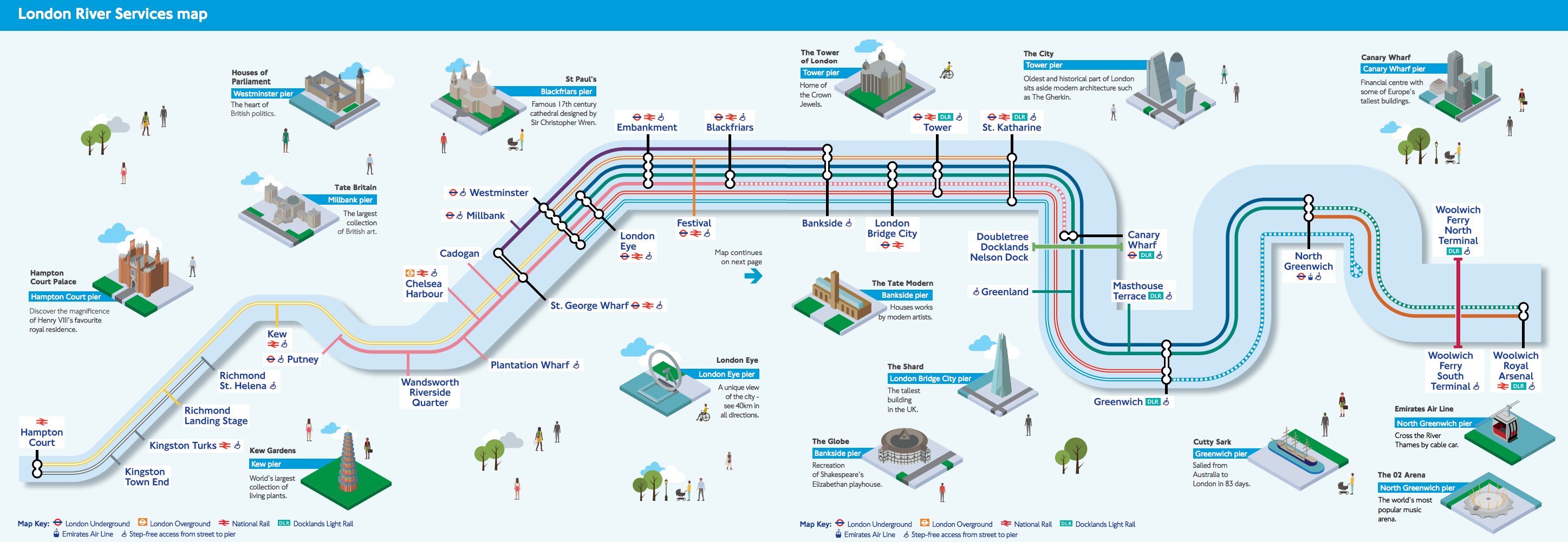
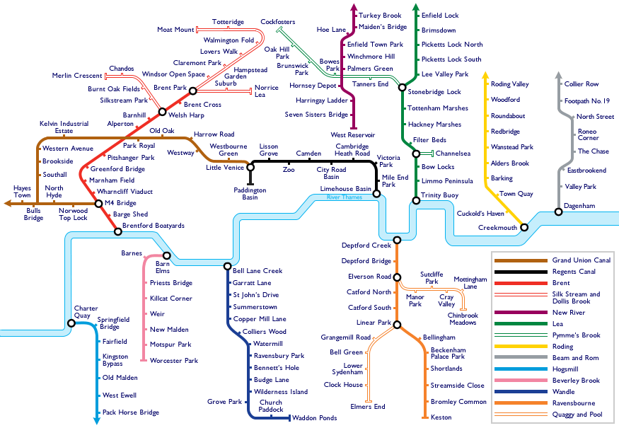
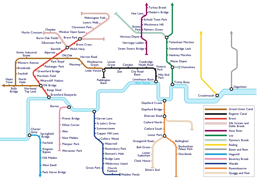
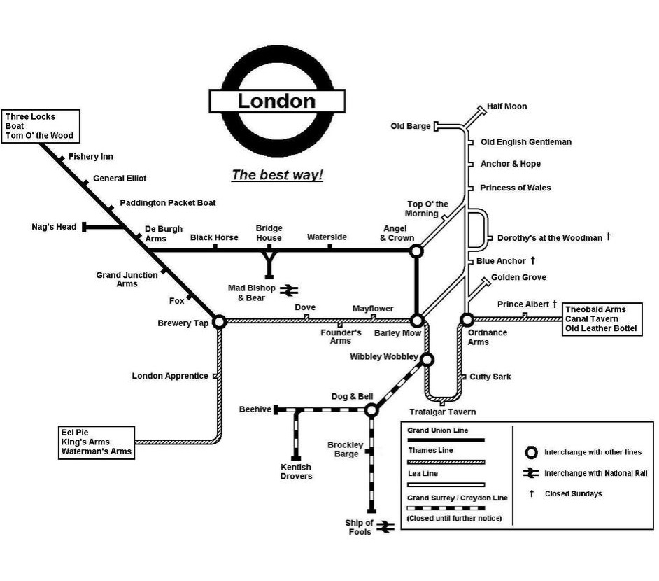
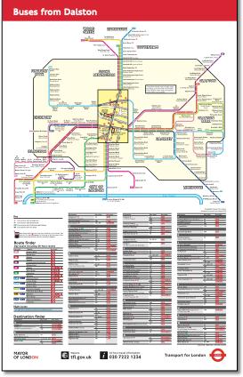
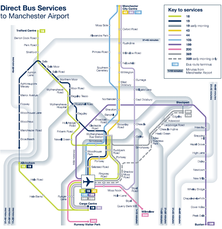
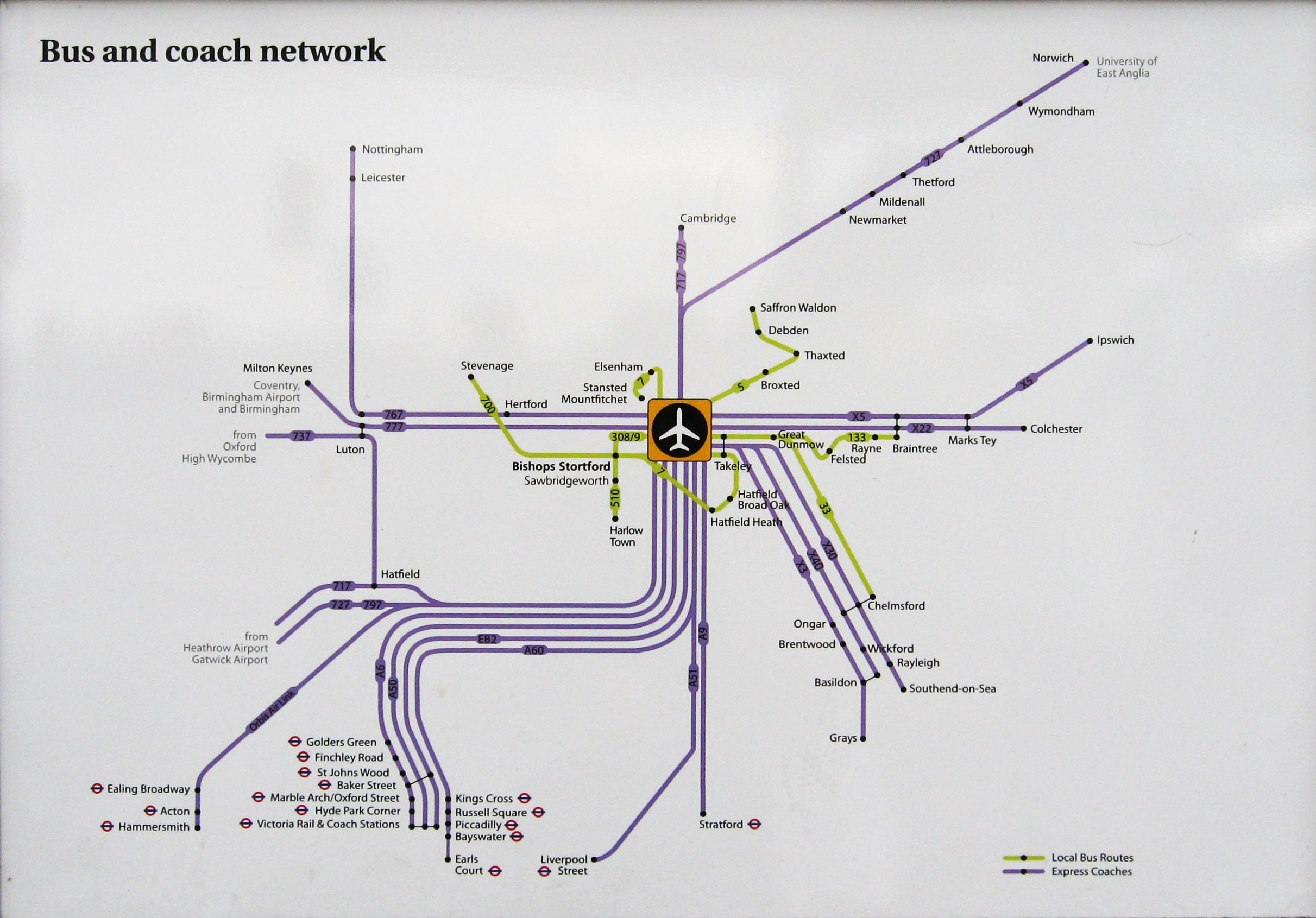
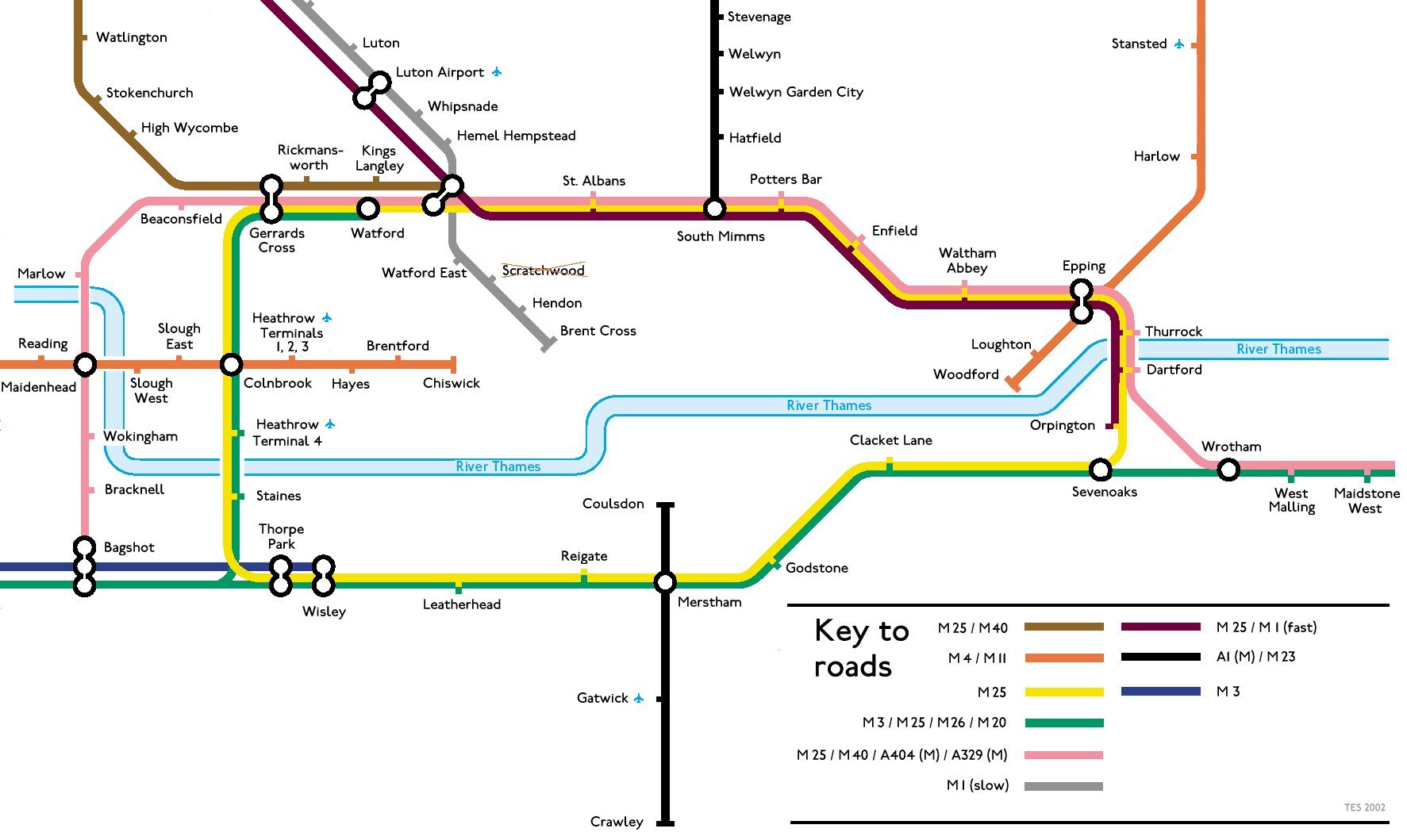
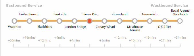
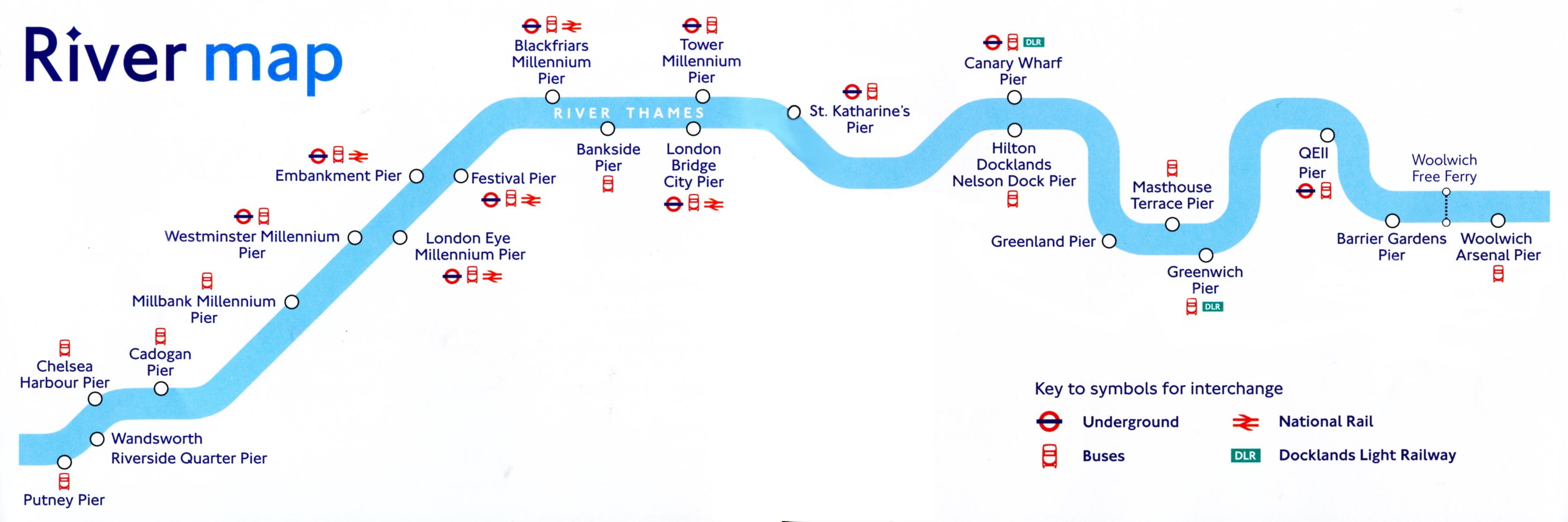
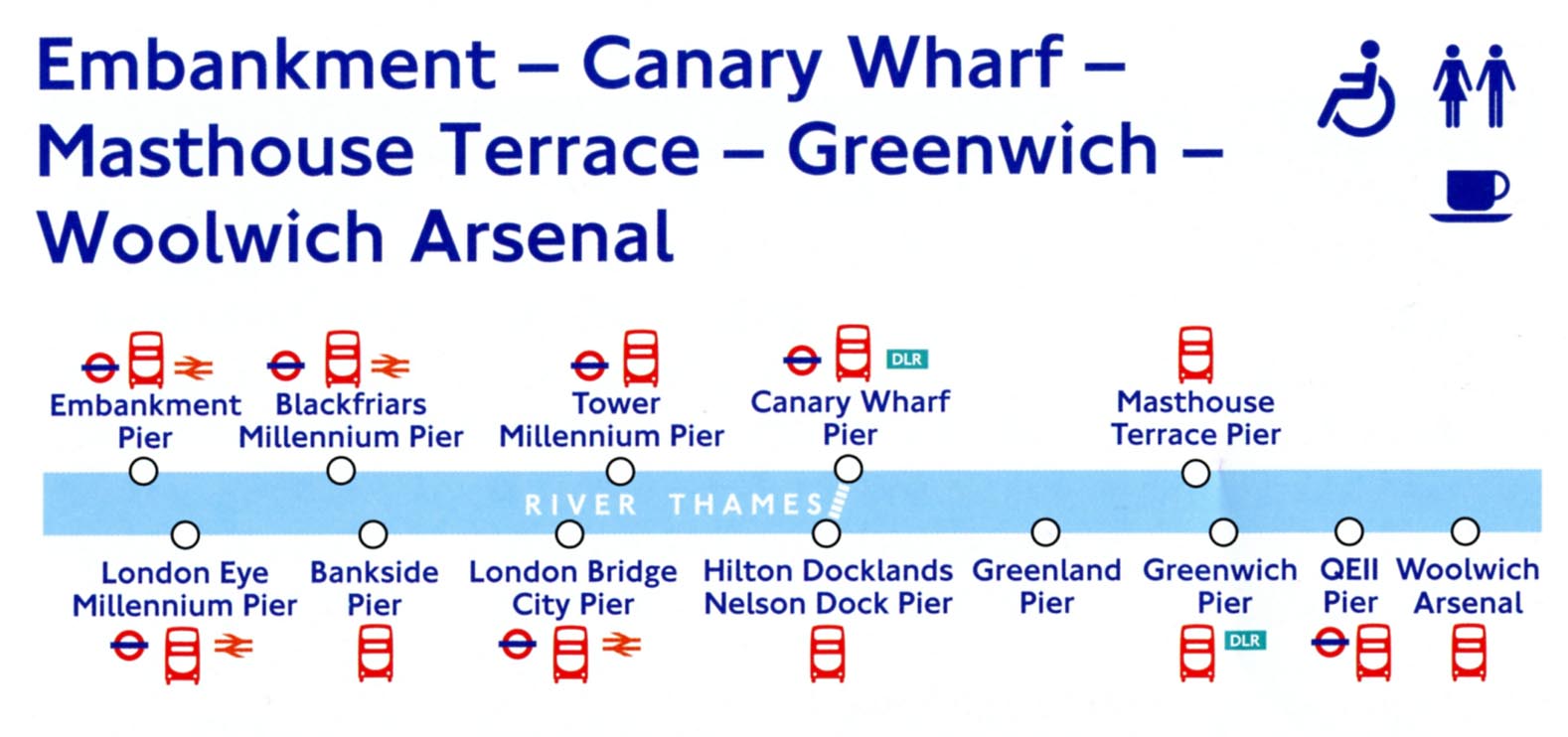
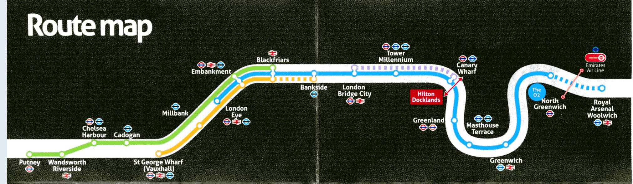
London bus maps on a rail map web site? Just a couple of examples here to show TfL's rail map designers what can be done. The concept of these maps individually produced for every bus stop and shelter, is excellent, enabling users to find their stop on the geographic part of the map and their destination on the diagrammatic part. The quality is also there, just look at those carefully crafted curves and aligning dots. Whoever has managed this project should get a free bus pass for life. And go and sort out those oh so poor tube maps. |
||||||||||||||||||||||||||||||||||||||||
 |
||||||||||||||||||||||||||||||||||||||||
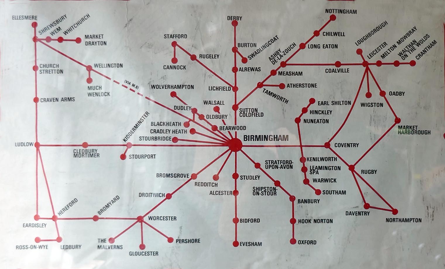
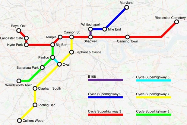
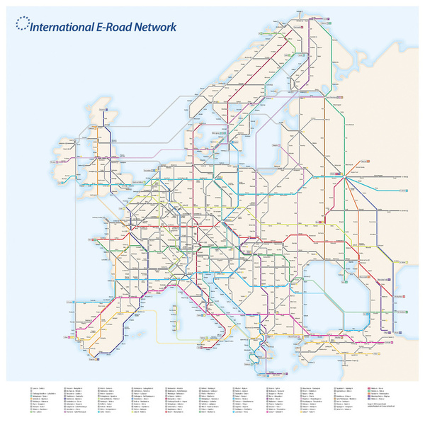
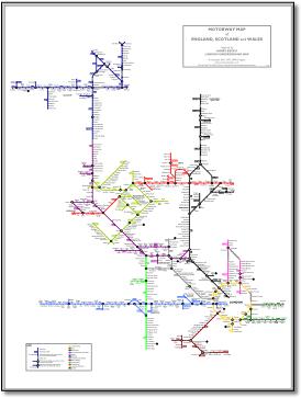
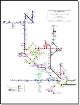
www.motorwaymap.co.uk |
||||||||||||||||||||||||||||||||||||||||
 |
||||||||||||||||||
 |
||||||||||||||||||
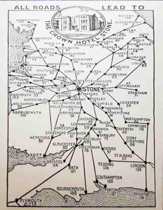
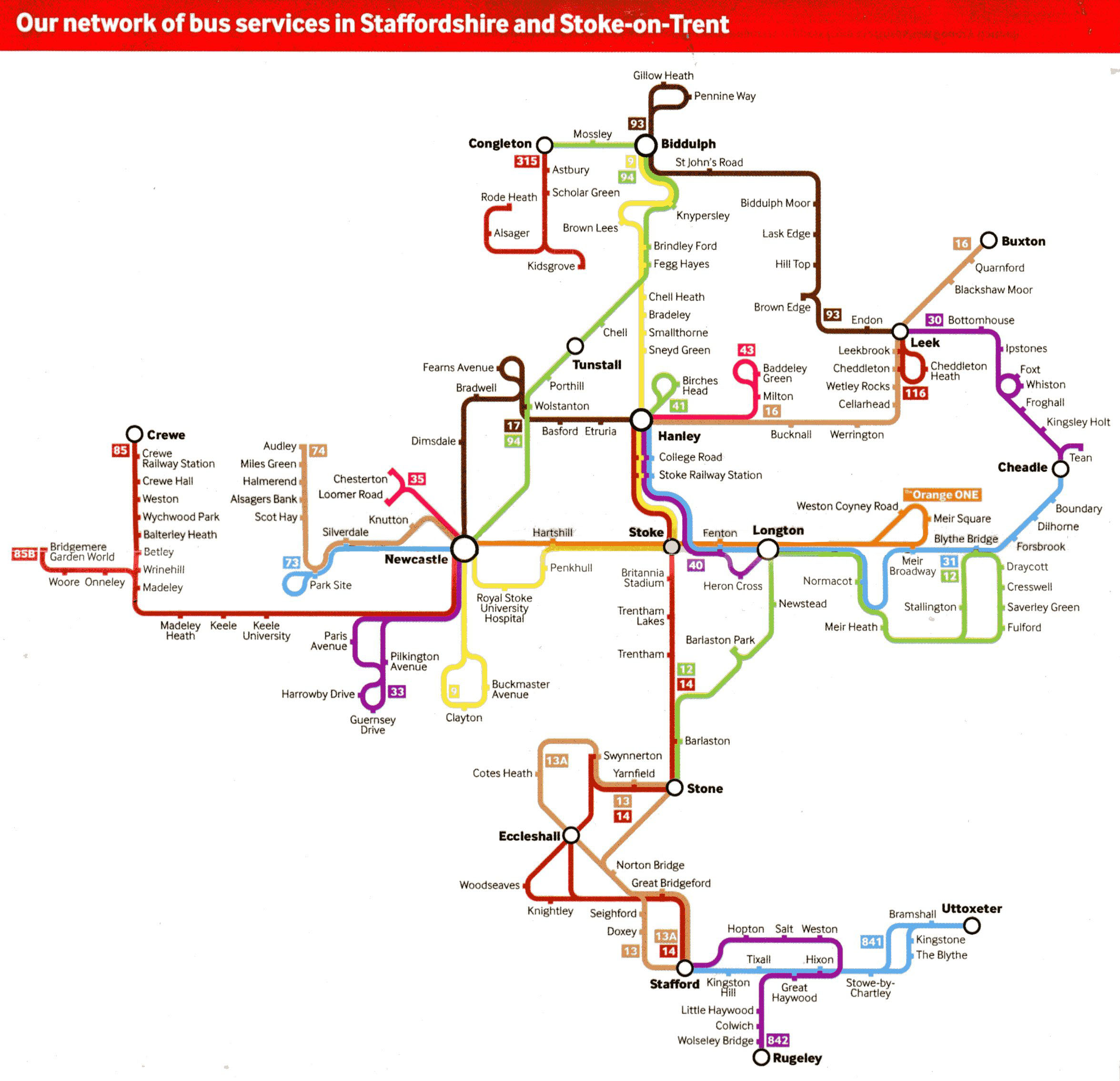
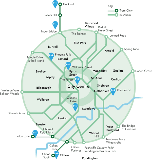
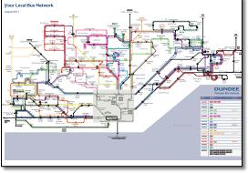
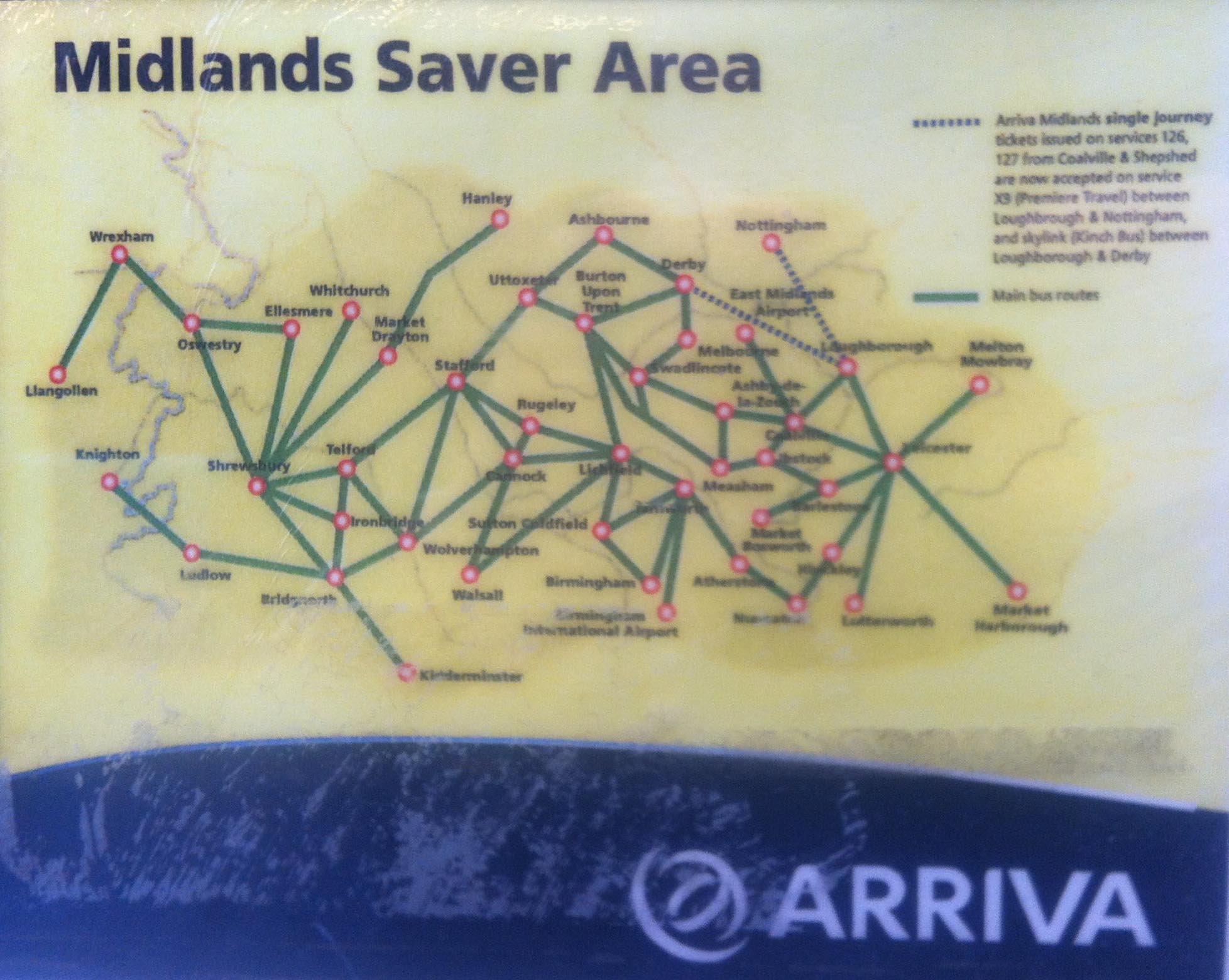
Having lived and worked in the Potteries, I've got a photo (which I can't find) of a map like this in a bus shelter. I liked it for evenness and clarity. Unusually, the Potteries has a network of city centres (the five or six towns) which make the map more challenging - most city networks radiate from a single centre. Sticking to the 45 degree rule it puts the Newcastle/Hanley/Stoke triangle out of kilter. Rude, crude, thrown together with skilled abandon, I like this map. Its got a nicely drawn diagram underneath, its just the captions that let it down. I haven't even started looking at the bus maps available and if the subject has depth. And if I haven't mentioned it before, I do like this one. |
||||||||||||||||||
 |
||||||||||||||||||
 |
||||||||||||||||||
.gif) |
||||||||||||||||||
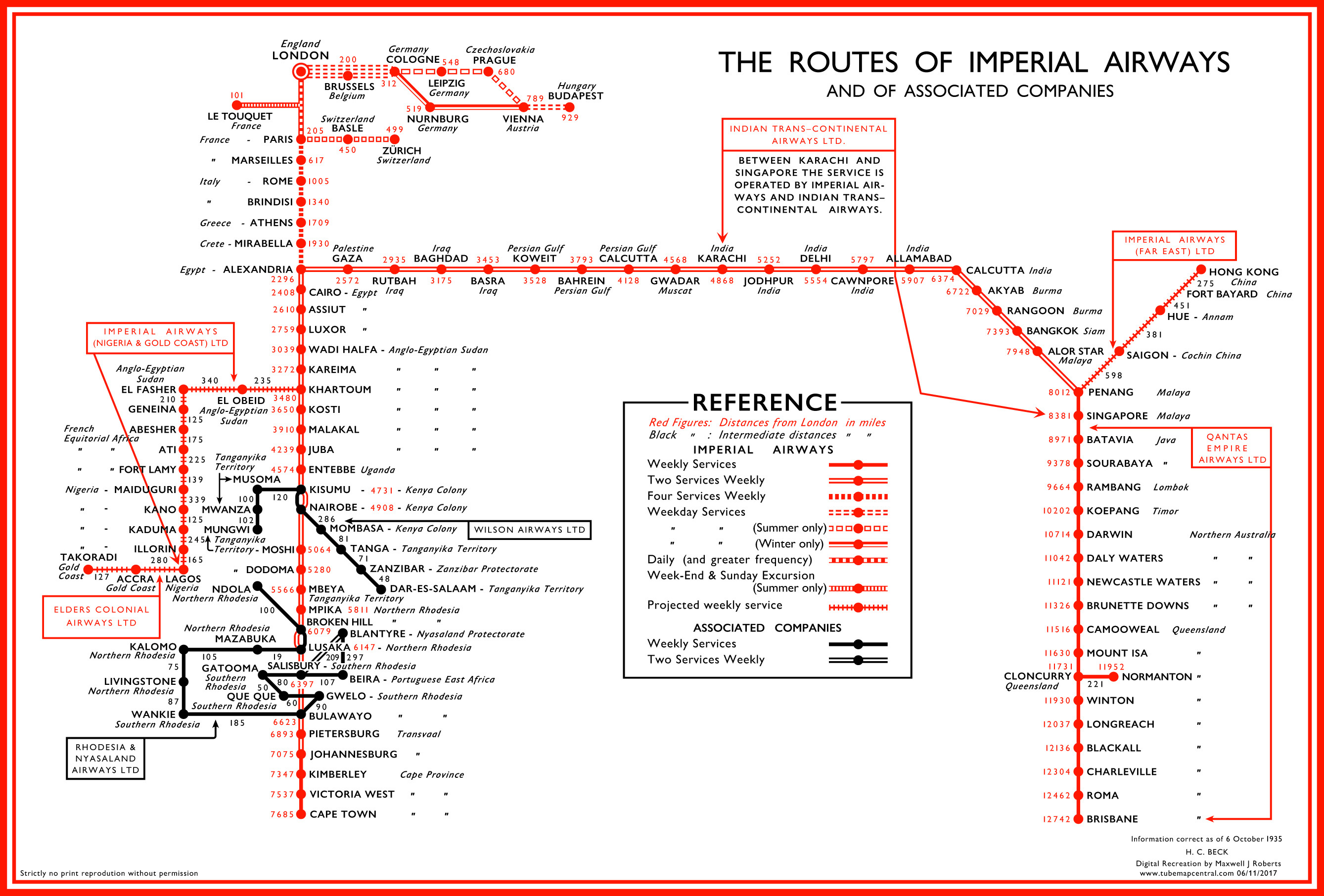
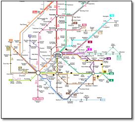
This is very old, but it trots out the usual 'iconic LT map' drivel, while not actually looking like the tube map. |
||||||||||||||||||
Far too small on the 1/3 A4 leaflet to be readable. Another terrible attempt to emulate the tube map design. Pretty poor overall. |
||||||||||||||||||
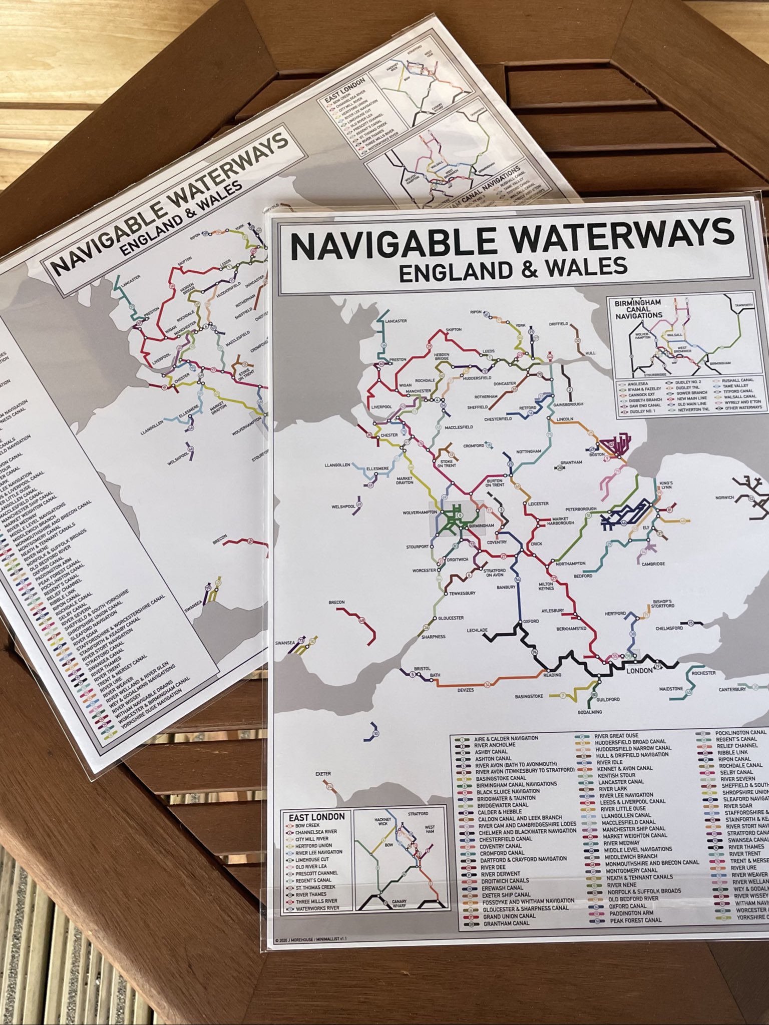
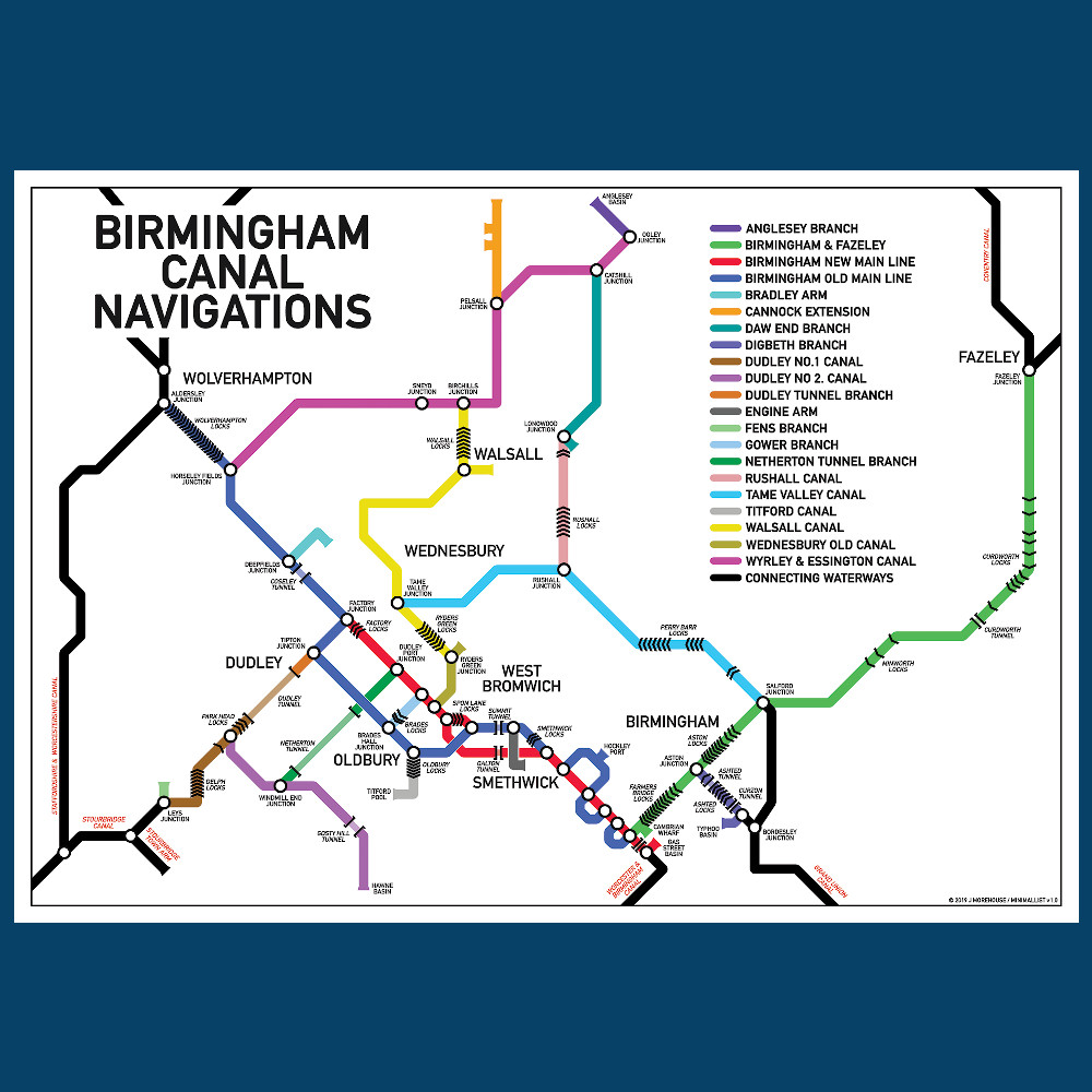
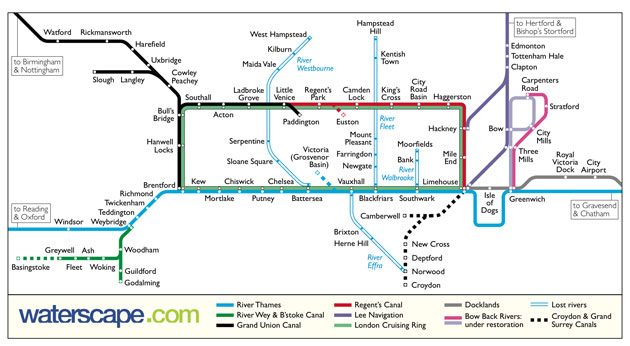
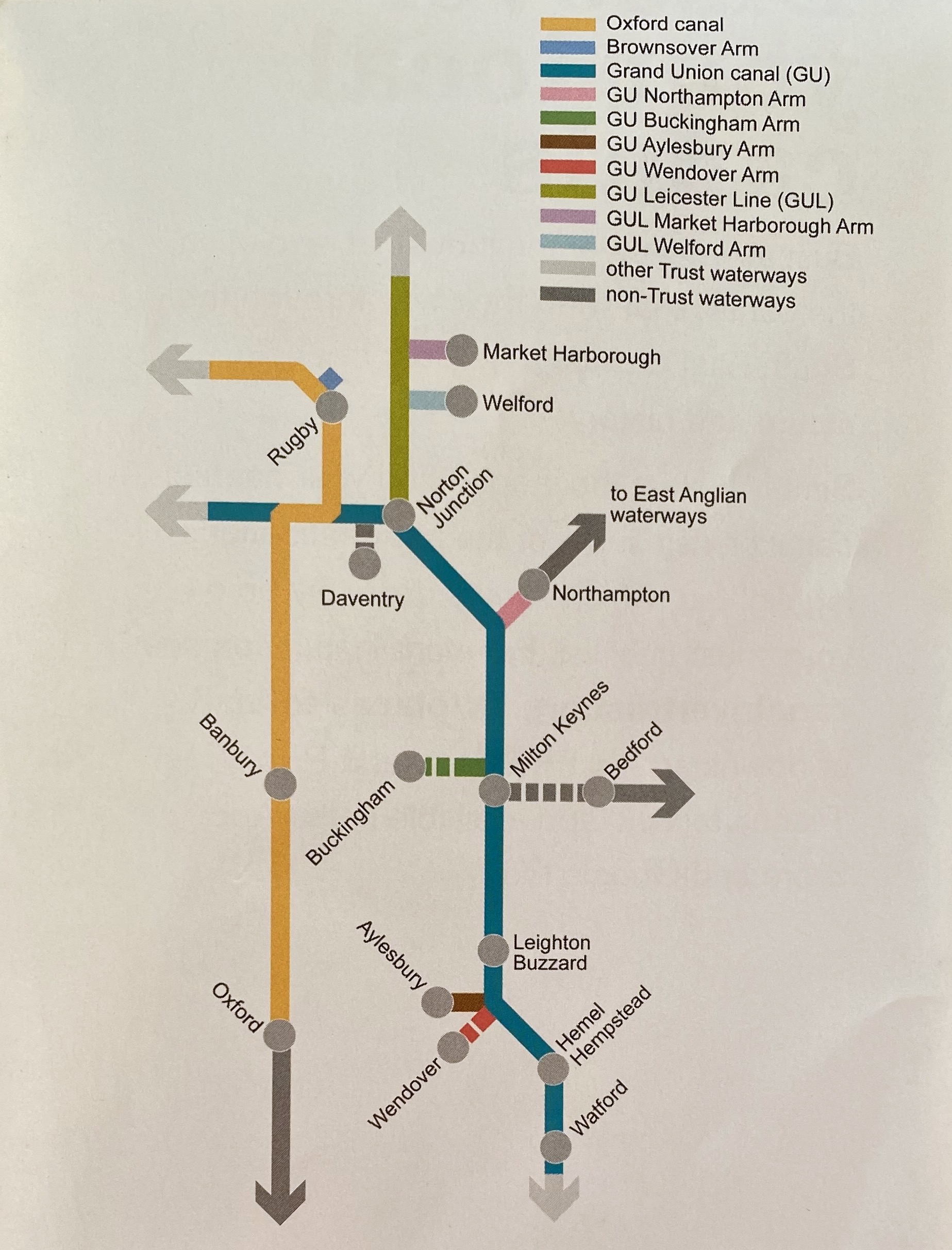
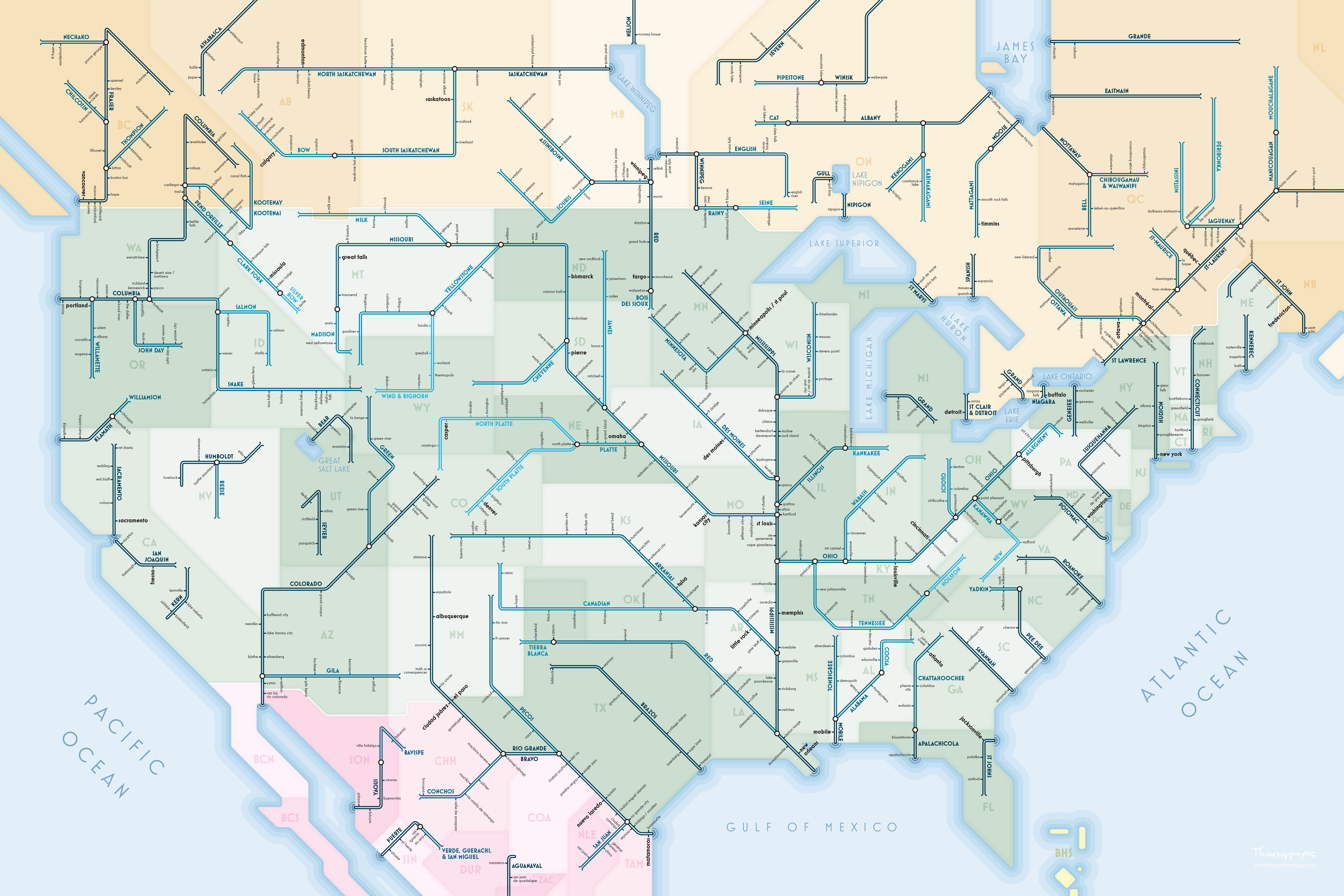
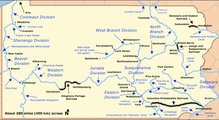
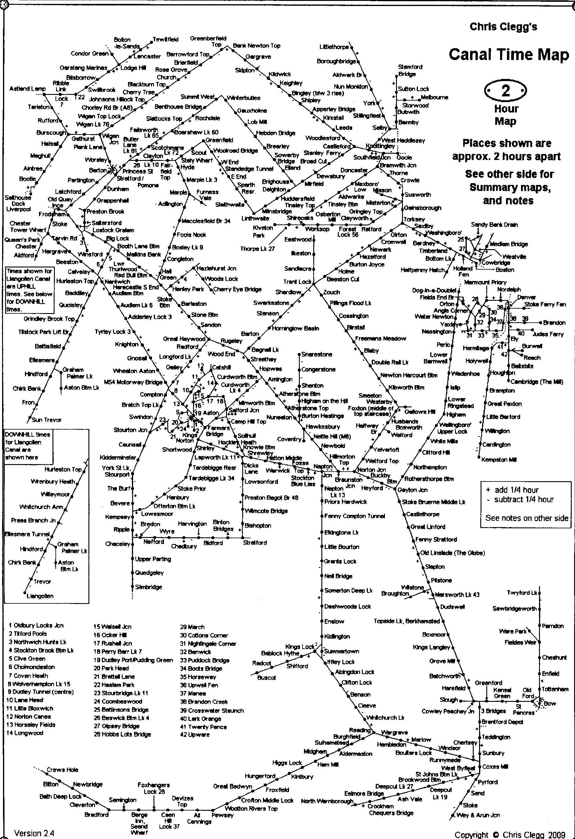
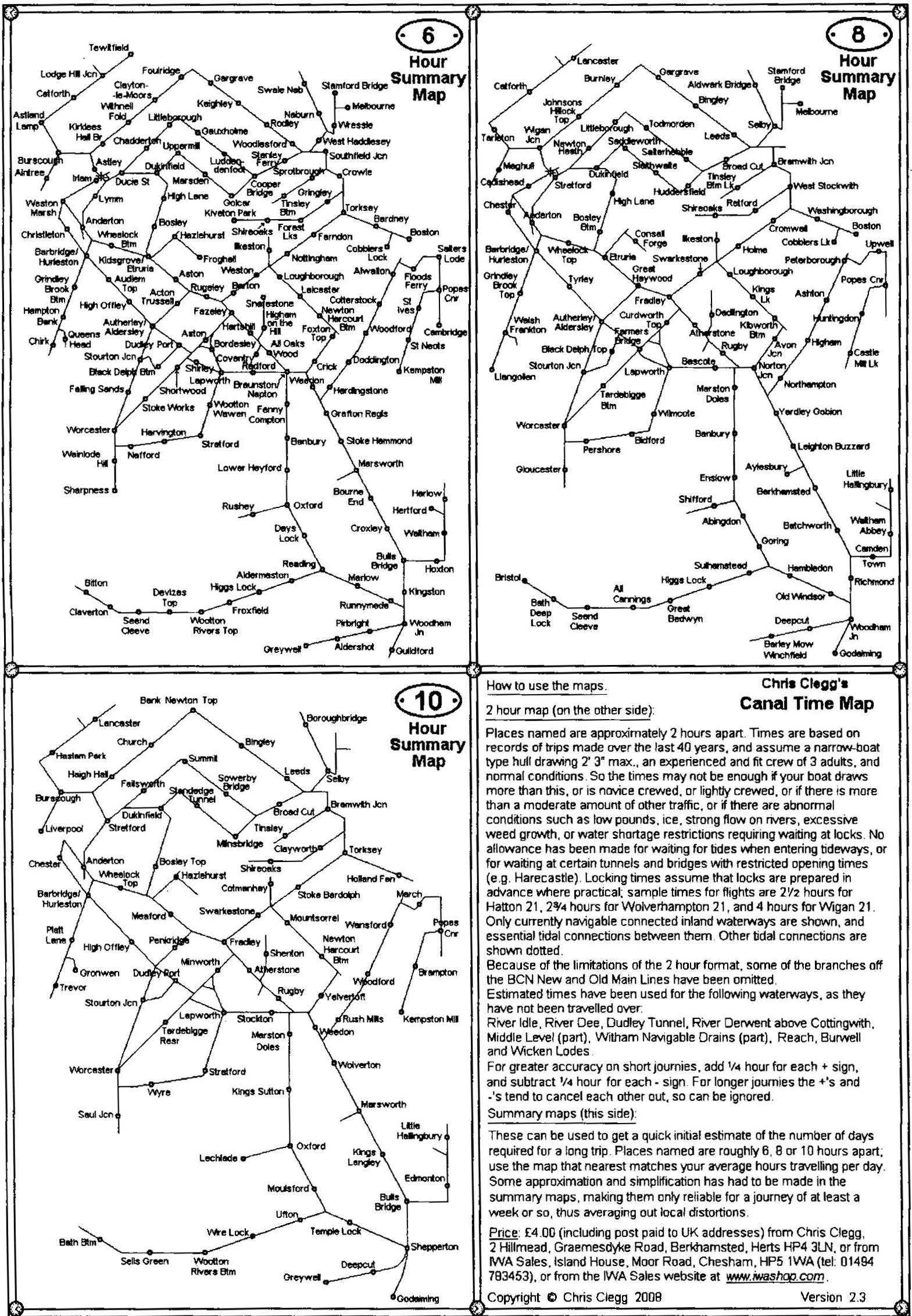
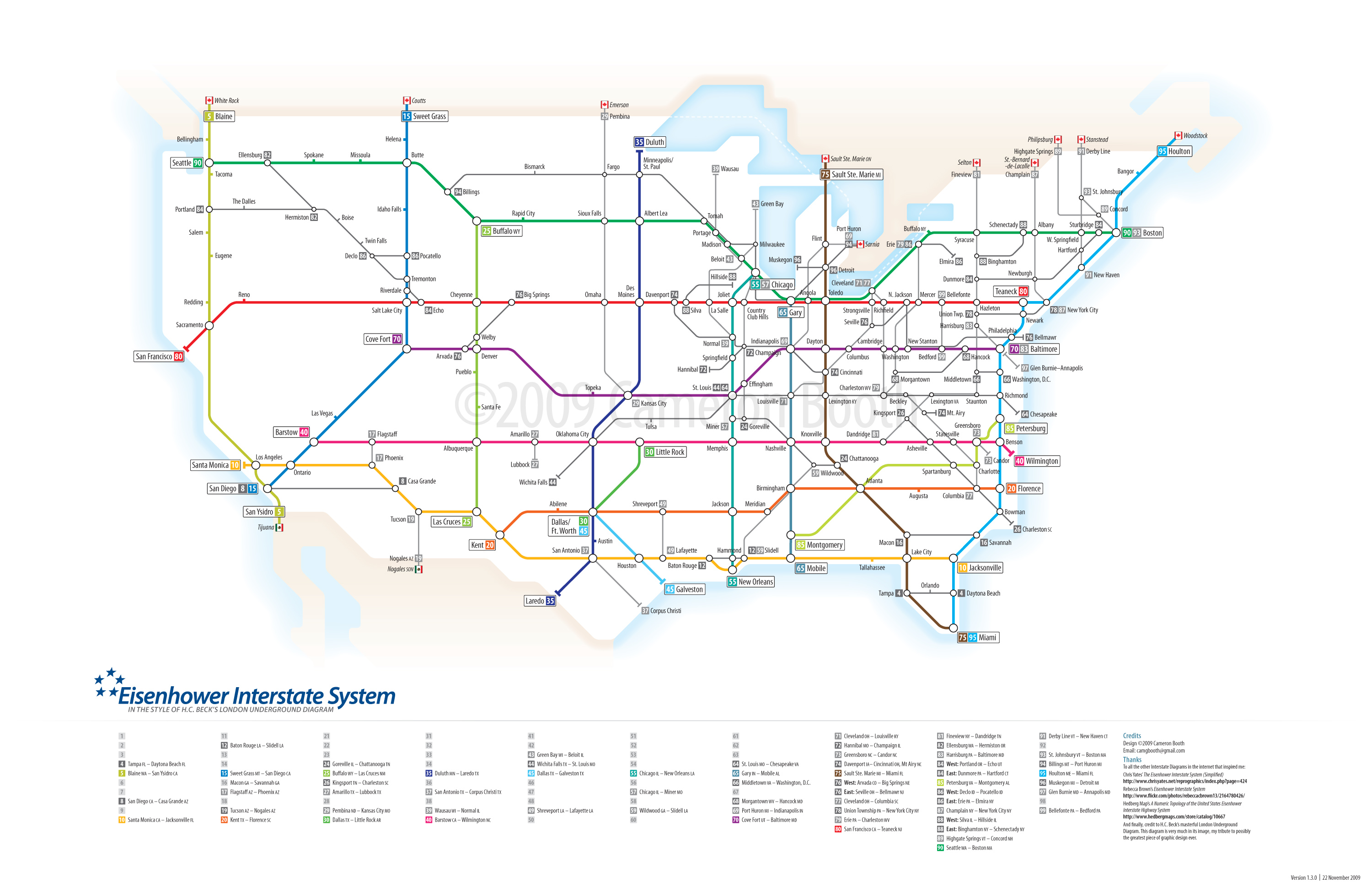
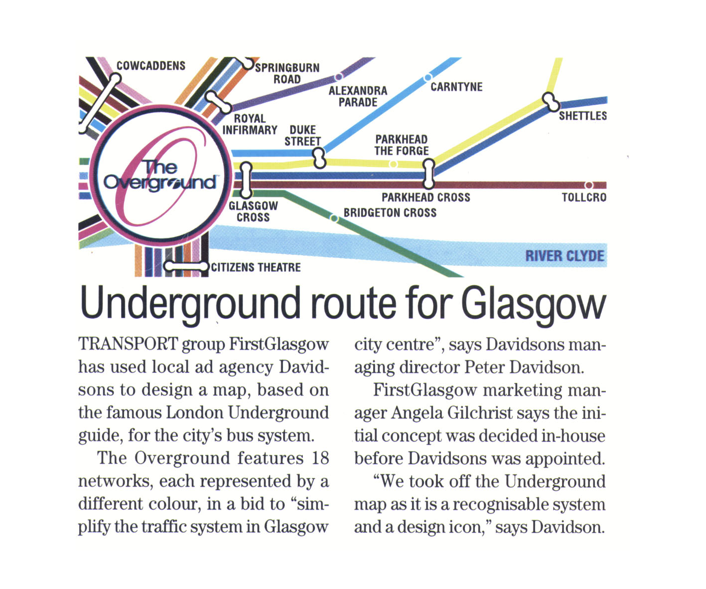
Created by Bob Evens, Worksop, UK. There are many rail and canal maps trying to use this 'standard' system on Wikipedia. I'm not sure about it, trying to keep one line straight, too many awkward bends. But the links are excellent. |
||||||||||||||||||
 |
||||||||||||||||||
 |
||||||||||||||||||
 |
||||||||||||||||||
 |
||||||||||||||||||
|
||||||||||||||||||
 |
||||||||||||||||||
 |
||||||||||||||||||
 |
||||||||||||||||||
 |
||||||||||||||||||
 |
 |
|||