|
 |
|
 |
|
 |
|
 |
|
|
|
|
|
|
|
|
 |
|
|
 |
|
 |
|
|
|
 |
 |
|
|
 |
|
 |
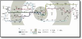
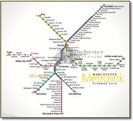
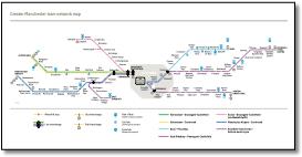
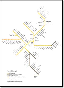
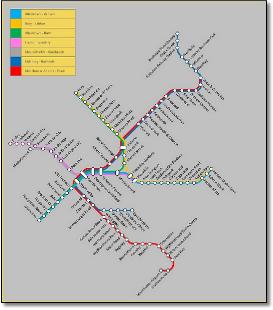
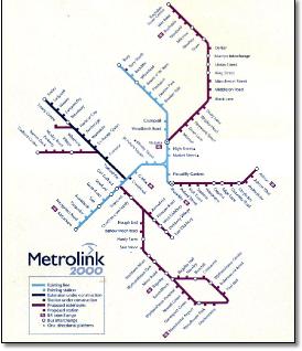
- Orange line removed.
|
 |
|
 |
- Orange line readded, mods to purple route
|
 |
|
|
|
|
|
|
|
|
|
 |
|
|
|
|
 |
|
|
|
 |
|
|
|
|
|
|
|
|
 |
|
|
 |
|
|
|
 |
|
|
|
|
|
|
|
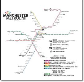
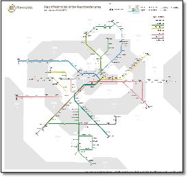
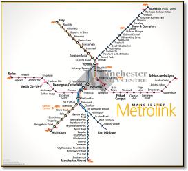
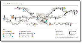
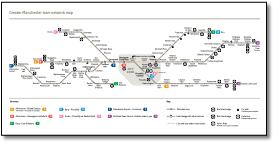
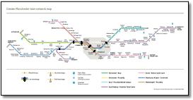
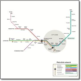
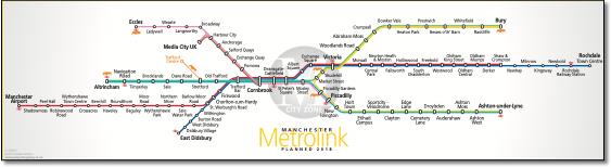
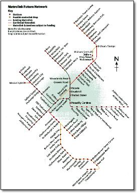
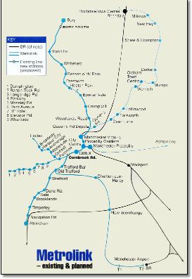
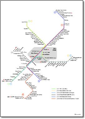
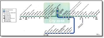
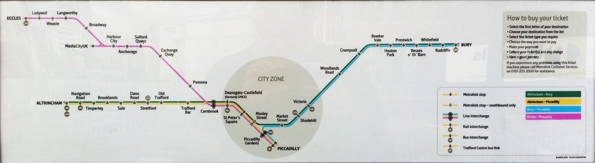
- Now with Intu Trafford Centre branch
- • Misplaced station symbols at Exchange Square
|
|
|
|
 |
|
|
|
|
|
 |
|
|
|
|
|
 |
|
|
|
|
 |
|
|
|
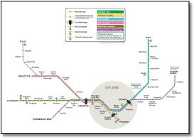
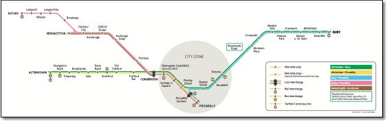
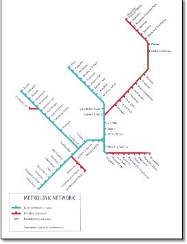
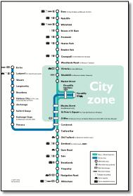
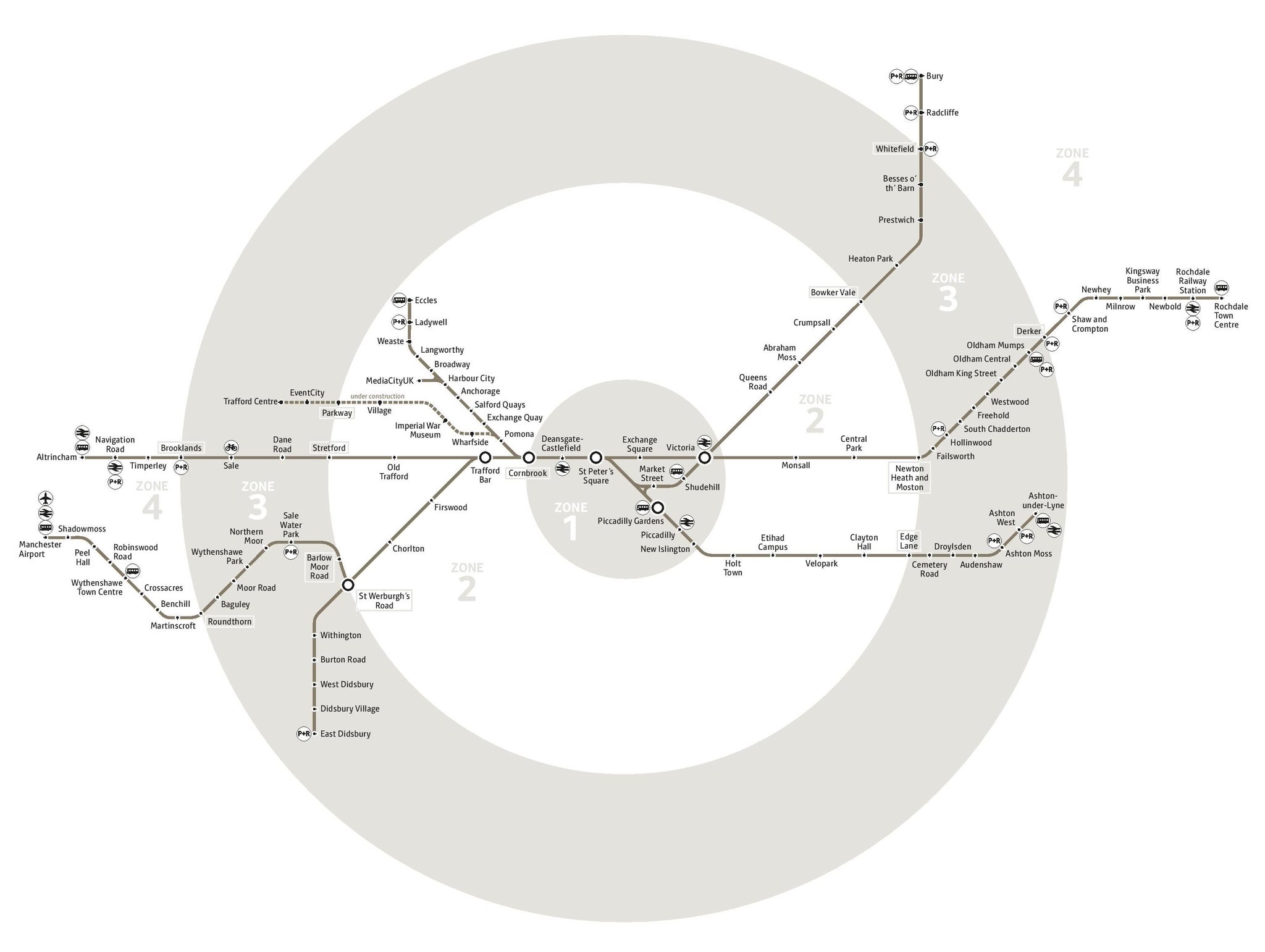
- • Now with Intu Trafford Centre branch
- • New interchange symbols
|
|
|
|
|
 |
|
|
|
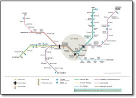
- Now with Intu Trafford Centre branch.
-
|
|
|
|
|
|
|
 |
|
|
 |
|
|
 |
|
 |
|
|
|
|
|
|
|
 |
|
 |
|
|
|
|
|
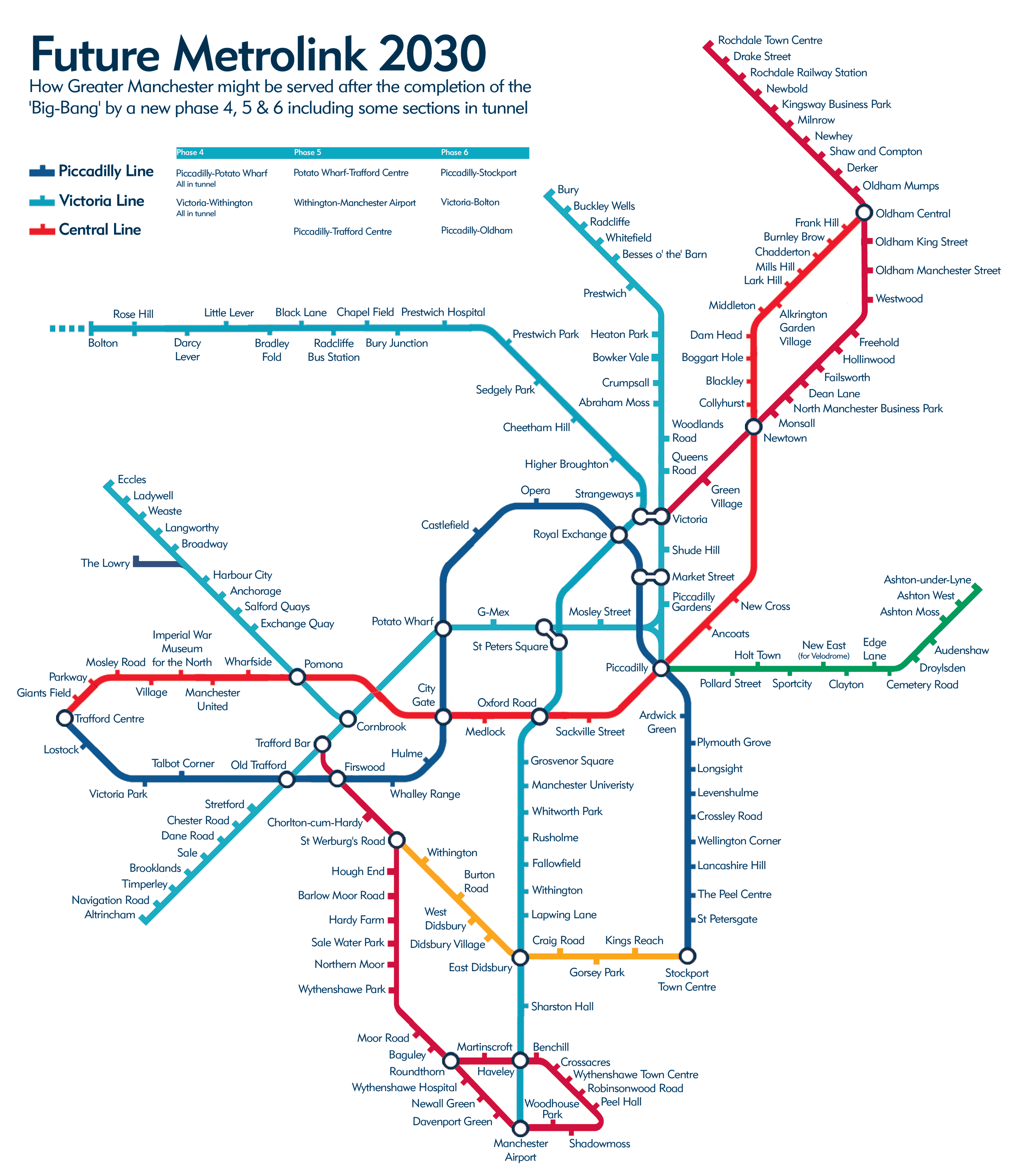
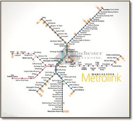
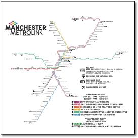
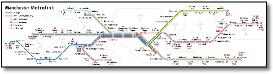
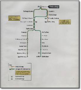
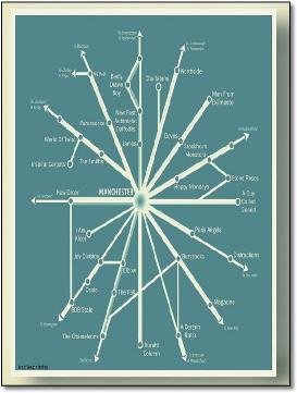
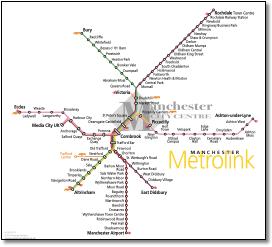
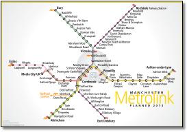
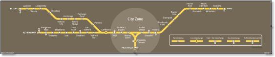
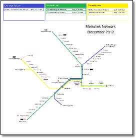
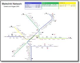
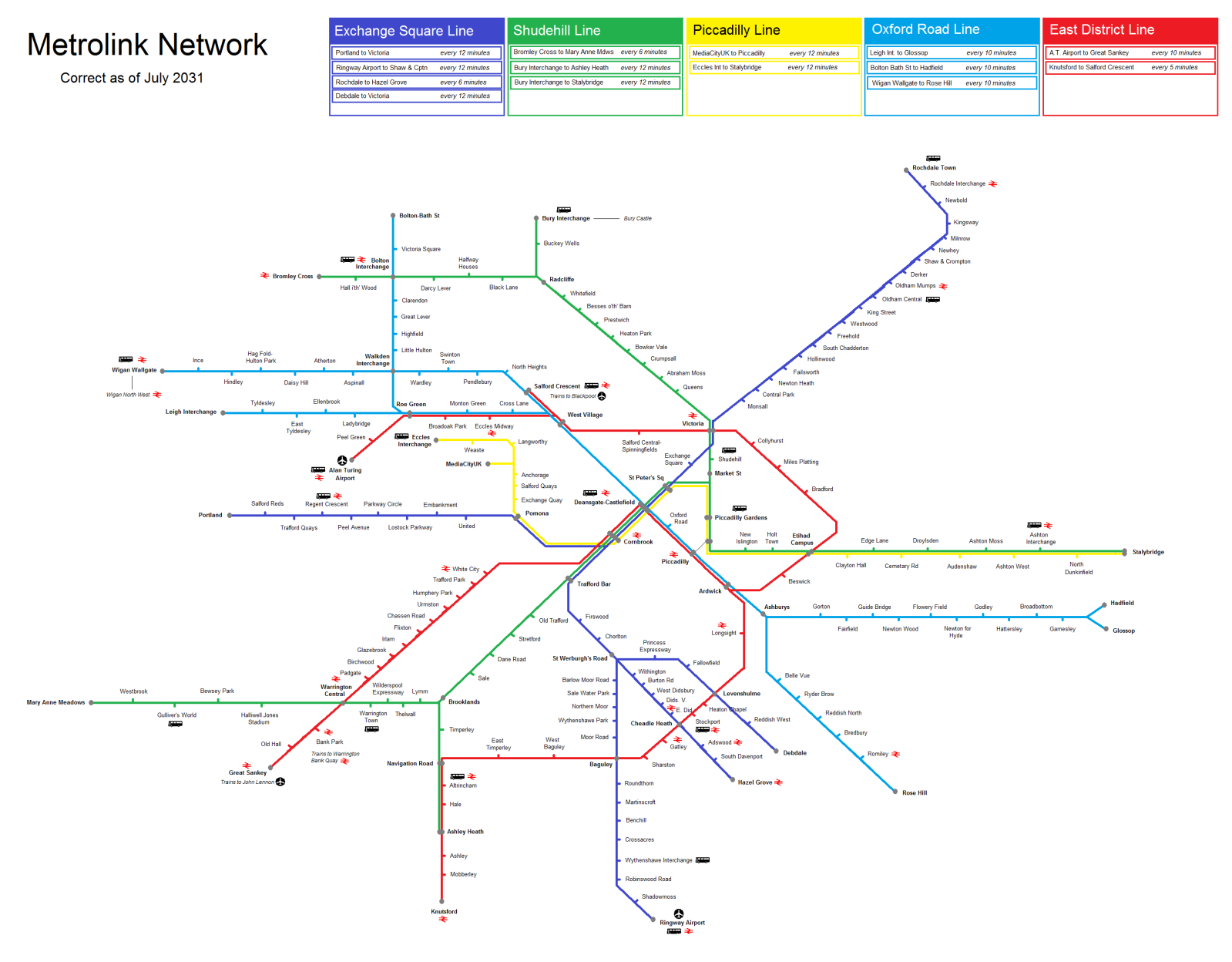
- • Didsbury and Airport branches transposed;
• Lines shown with unnecessary bends;
• Inefficient use of space, captions too small, much smaller than leaflet text;
• Symbols impossibly small to see at printed size;
• Zone circles not symmetrically placed;
• Ashton and Didsbury routes: line duplication only shows a service that stops short of the terminus, is not an additional route
|
|
|
|
|
|
 |
|
|
|
|
|
 |
|
|
|
|
 |
|
|
|
 |
|
|
|
 |
|
|
|
|
|
|
 |
|
|
|
|
 |
|
|
|
 |
|
|
 |
|
|
|
 |
|
|
 |
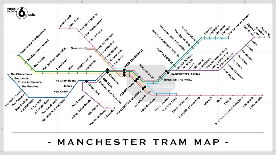
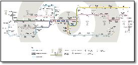
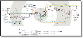
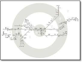
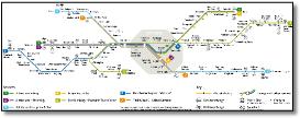
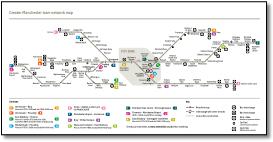
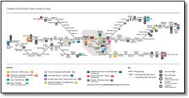
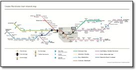
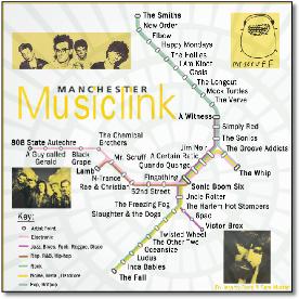
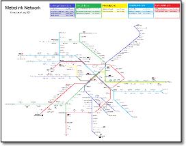
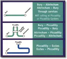
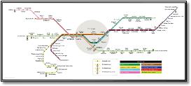
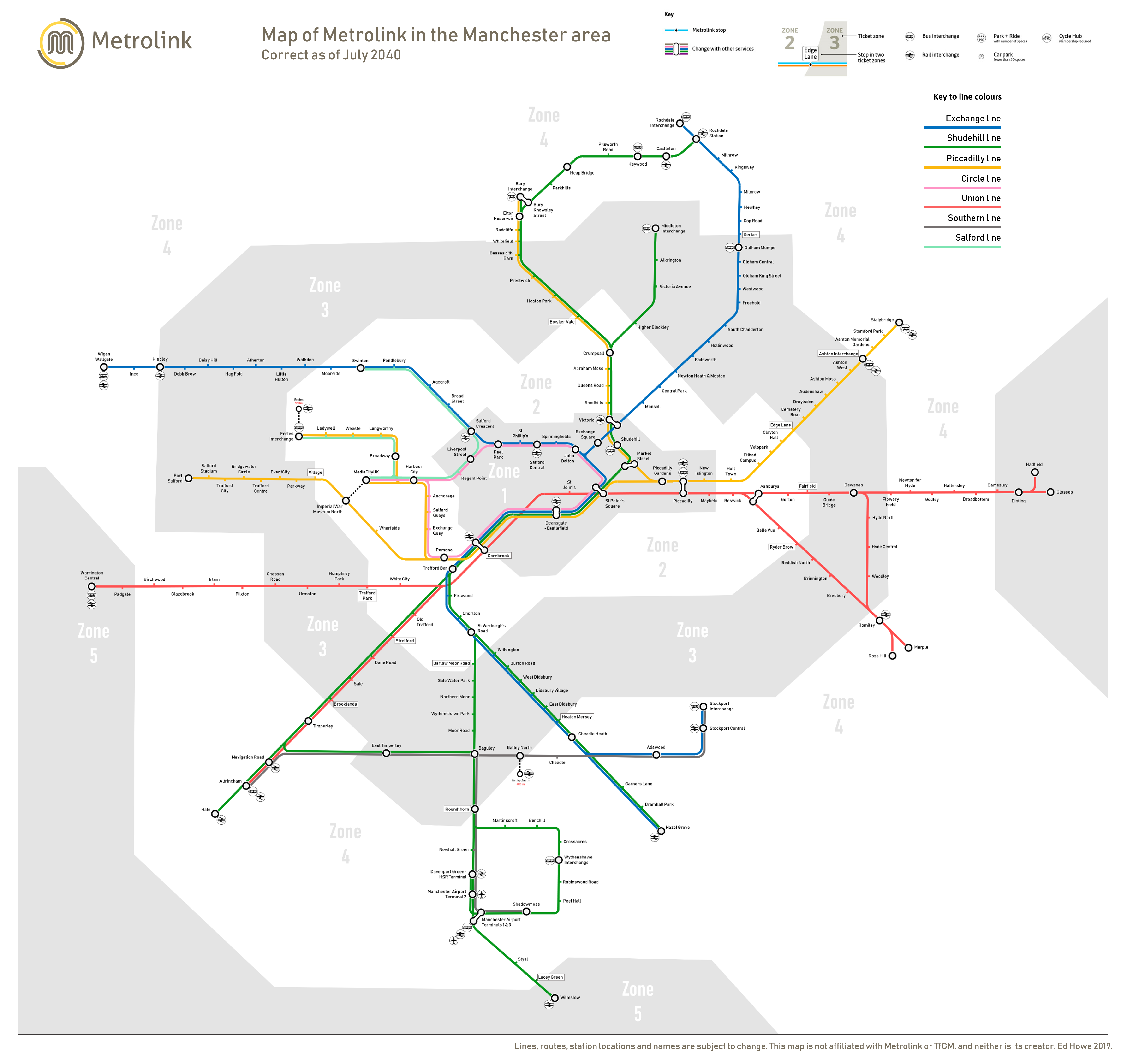
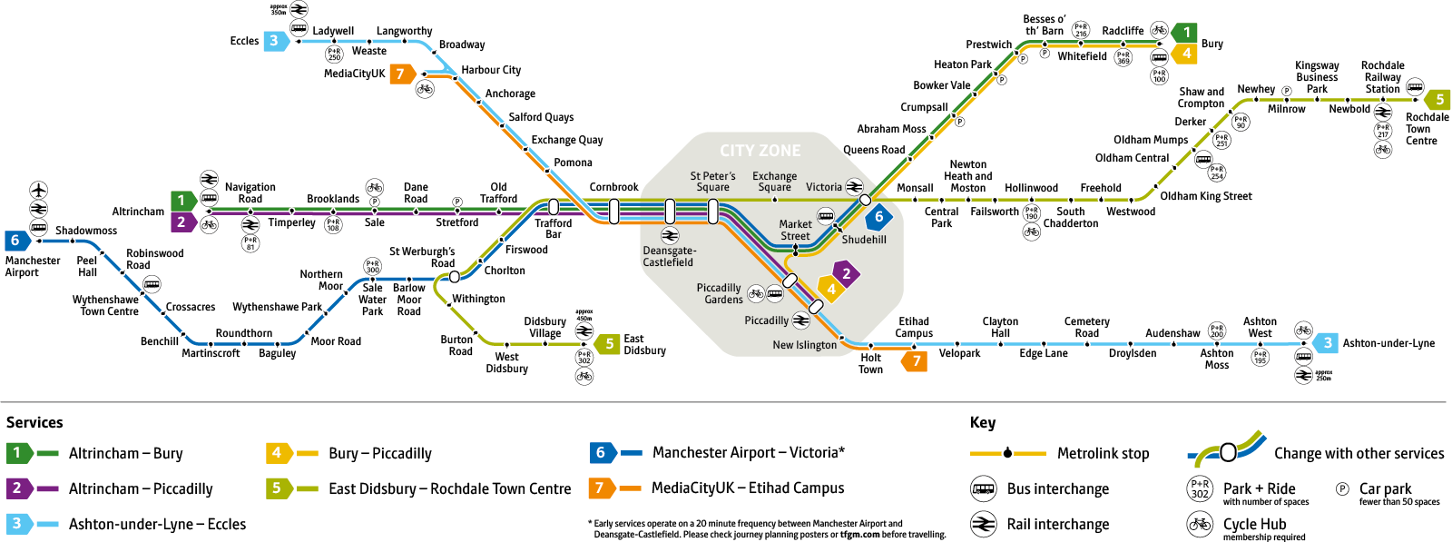
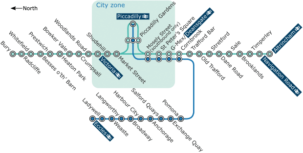
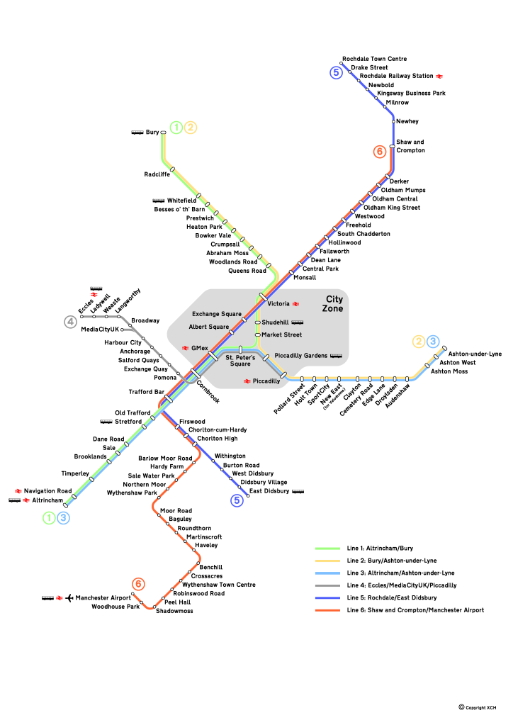
- These two Project Mapping versions with four colours to denote the different city centre routes was inspired by a piece in CityMetric.
|
 |
|
|
|
|
|
|
|
 |
|
|
|
|
|
 |
|
|
|
|
|
|
 |
|
|
|
|
|
 |
|
|
|
|
|
 |
|
 |
|
|
|
|
|
 |
|
|
|
|
|
 |
|
 |
|
|
|
|
|
 |
|
|
|
|
|
 |
|
 |
|
|
|
|
|
 |
|
 |
|
|
|
|
 |
|
|
|
|
|
 |
|
|
|
|
|
 |
|
 |
|
|
|
|
|
 |
|
 |
|
|
|
|
|
|
|
|
|
|
 |
|
|
|
|
|
 |
|
|
|
 |
|
 |
|
|
|
|
|
 |
|
 |
|
|
|
|
|
 |
|
|
|
|
|
 |
|
|
|
|
|
|
 |
|
 |
|
|
|
 |
|
|
|
|
|
 |
|
|
|
|
|
 |
|
 |
|
|
|
|
|
 |
|
|
|
|
|
|
|
 |
|
|
|
 |
 |
|
|
 |
|
|
|
|
 |
|
|
|
 |
 |
|
|
 |
|
|
|
|
 |
|
|
|
|
|
|
|
 |
|
|
|
 |
|
|
 |
 |
 |
|
|
|
|
|
|
 |
|
|
 |
|
|
|
|
 |
|
|
|
|
|
 |
|
|
 |
|
|
 |
|
 |
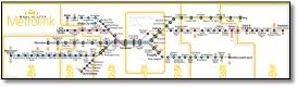
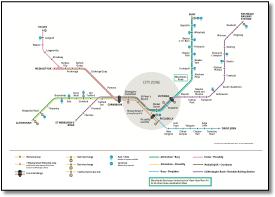
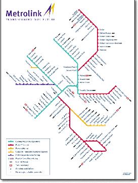
- All very pretty but all too small. Why bother with those tiny symbols and key?
Poor station/caption spacing. Couldn't it bear some relationship to geography?
|
 |
|
|
|
|
|
|
|
|
|
 |
|
|
 |
|
|
 |
|
|
|
|
|
|
|
|
 |
|
|
|
|
 |
|
|
|
 |
|
|
|
|
|
 |
|
|
|
|
|
 |
|
|
 |
|
|
 |
|
|
|
|
 |
|
|
|
|
|
 |
|
|
|
|
|
|
|
 |
|
|
|
 |
|
 |
|
|
|
|
|
|
|
 |
|
 |
|
|
 |
 |
|
|
|
 |
|
|
 |
|
|
|
|
 |
|
|
|
|
|
 |
|
|
|
|
|
 |
|
|
 |
|
|
|
|
|
|
|
 |
|
|
|
|
|
 |
|
|
|
|
|
 |
|
|
|
|
|
 |
|
|
|
 |
|
|
|
|
|
 |
|
|
 |
|
|
|
 |
|
|
 |
|
|
|
|
|
|
|
|
|
|
|
 |
|
|
|
|
|
 |
|
|
|
 |
|
|
|
|
|
 |
|
|
|
 |
|
 |
|
|
|
|
|
 |
|
|
|
|
 |
|
|
|
|
|
 |
|
|
|
|
|
 |
|
|
|
|
|
 |
|
|
|
|
|
 |
|
|
|
|
|
 |
|
 |
|
|
|
|
|
|
|
 |
|
 |
|
|
|
|
|
 |
|
|
|
|
|
 |
|
|
|
|
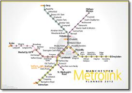
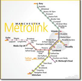
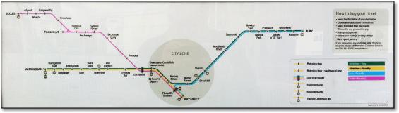
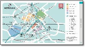
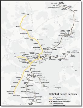
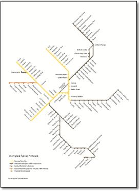
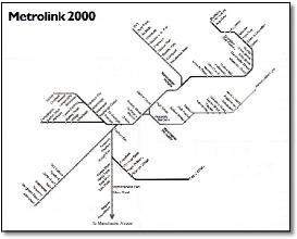
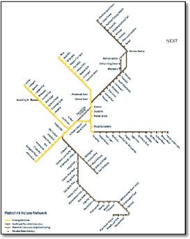
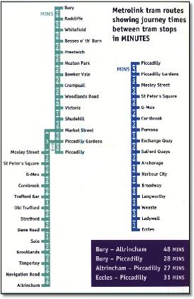
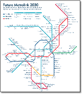
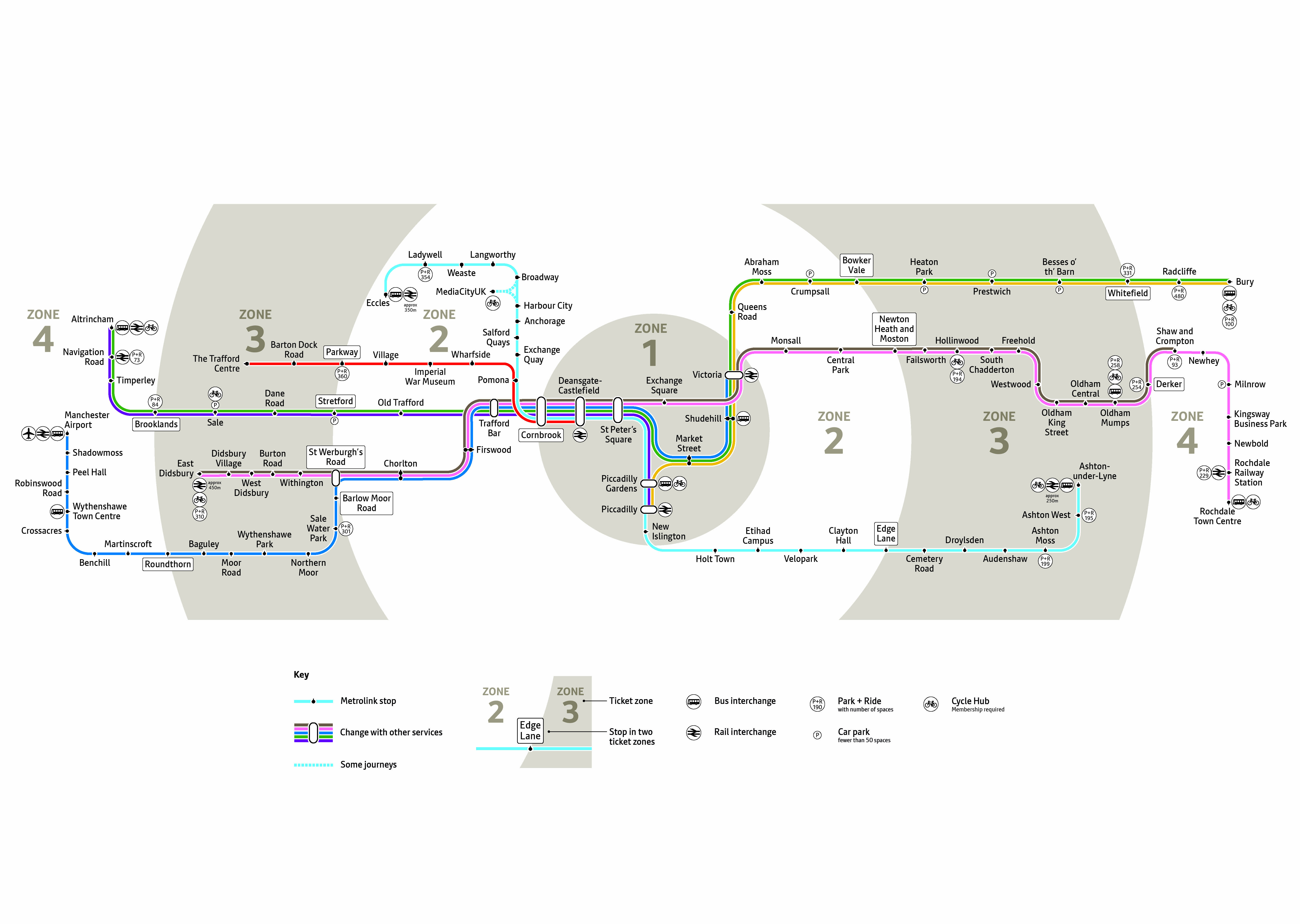
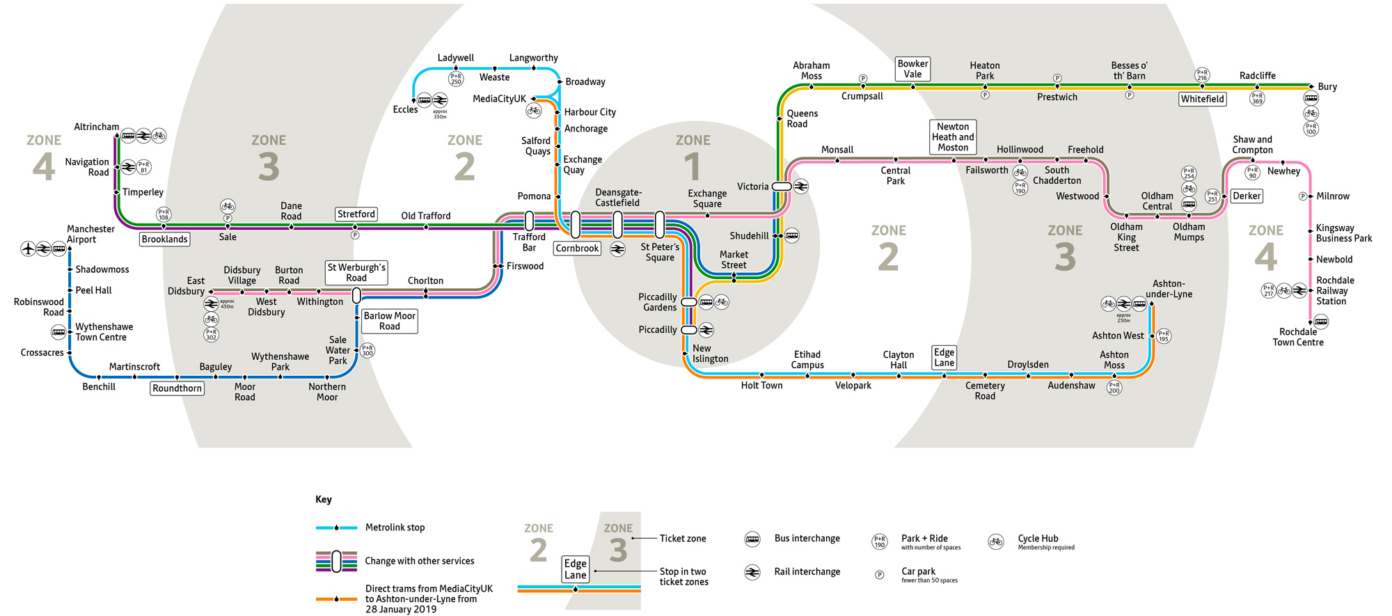
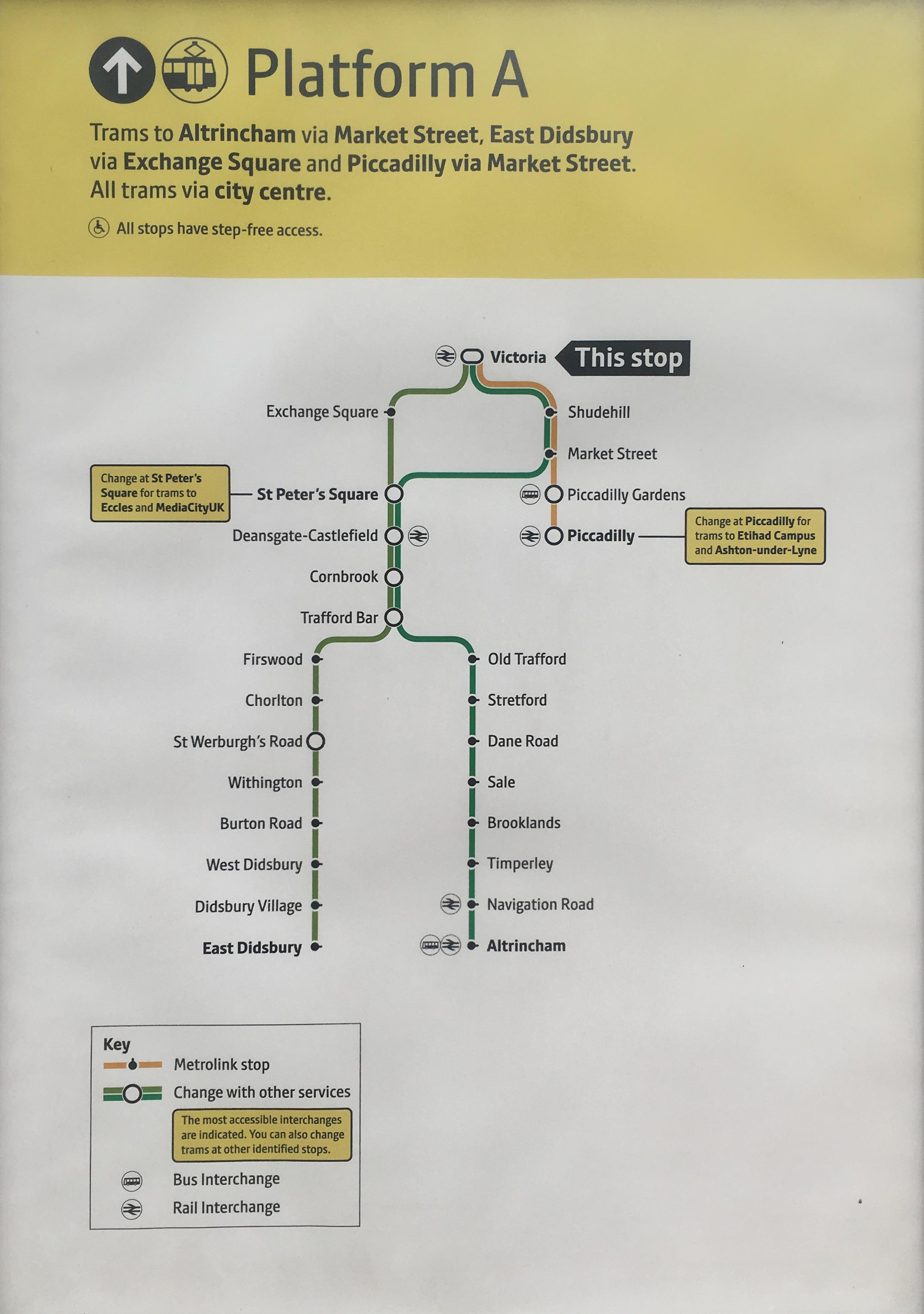
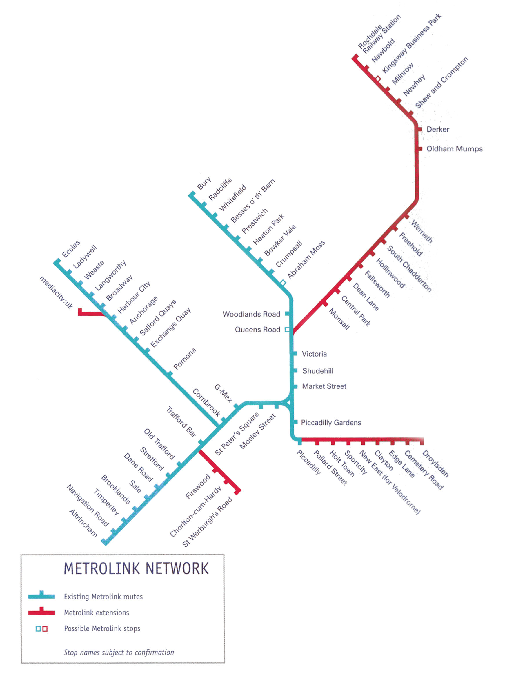
- These three graphics come from the same leaflet.
|
|
|
|
|
|
|
|
 |
|
|
|
 |
|
|
|
|
|
 |
|
|
|
|
|
 |
|
|
|
|
|
 |
|
|
|
|
|
 |
|
|
|
 |
 |
|
|
 |
|
|
|
|
|
|
 |
|
|
|
 |
|
|
|
|
|
 |
|
|
|
 |
 |
|
|
 |
|
|
|
|
 |
|
|
|
|
|
 |
|
|
|
|
|
|
|
 |
|
|
|
|
|
 |
|
|
|
 |
|
|
|
|
|
 |
|
|
|
|
 |
|
|
|
|
|
|
|
 |
|
|
|
|
|
 |
|
|
|
|
 |
|
|
 |
|
|
|
|
|
|
|
|
|
|
|
|
|
|
|
|
|
|
|
|
|
|
|
|
|
|
|
|
|
|
|
|
|
|
|
|
|
|
|
|
|
|
|
|
|
|
|
|
|
|
|
|
|
|
|
|
|
|
|
|
|
|
|
|
|
|
|
|
|
|
|
|


%20Retrieved%2019%20January%202019.png)


1.jpg)
1.png)
.jpg)
1.jpg)
1.jpg)
1.jpg)
1.jpg)

1.jpg)