 |
|||||||||||||||
|
|||||
|
|
||||
|
 |
|
|||
|
|||||
|
|||||
|
|||||
 |
 |
|||
 |
 |
 |
||||
 |
 |
|||||||
 |
||||||||
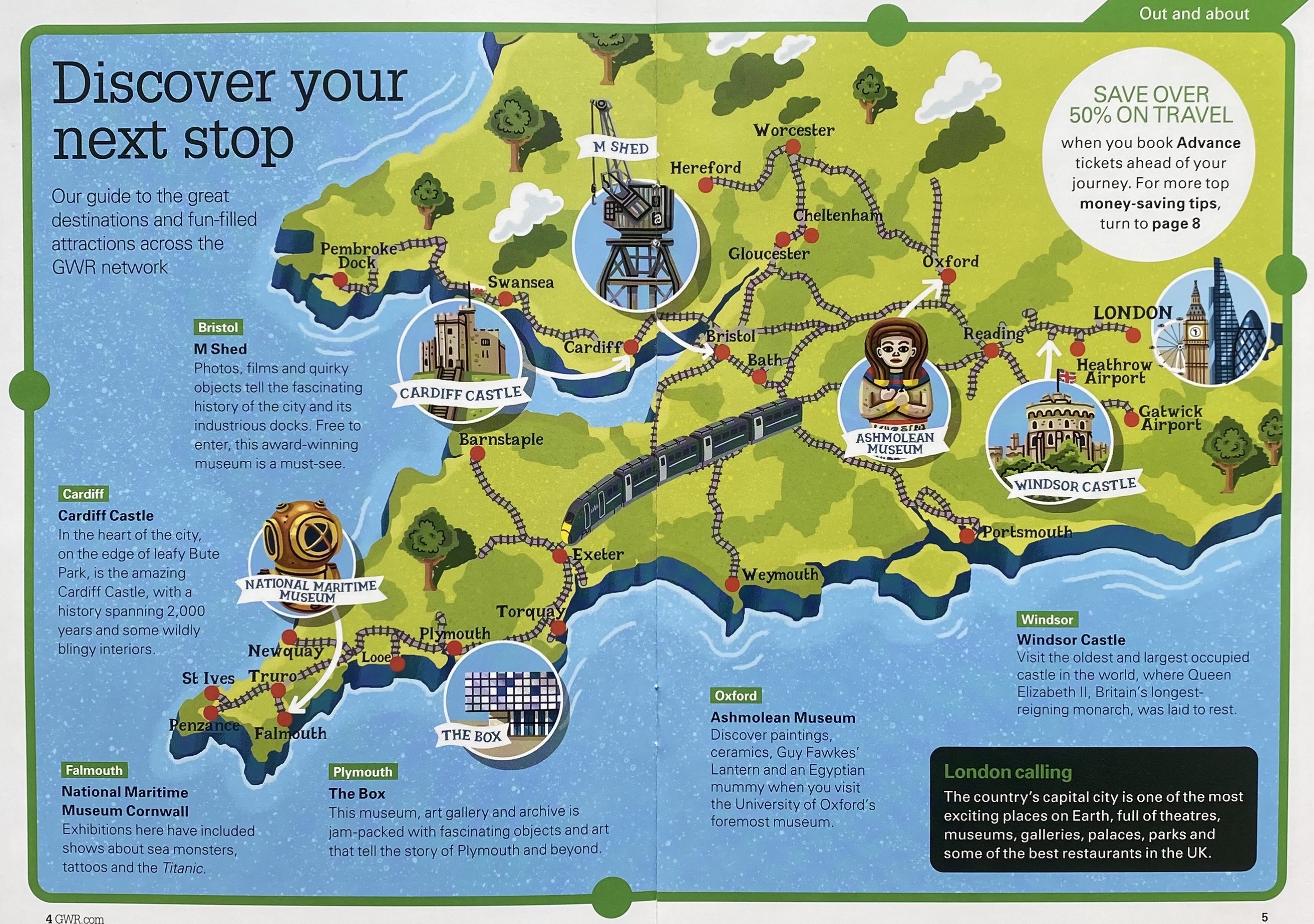
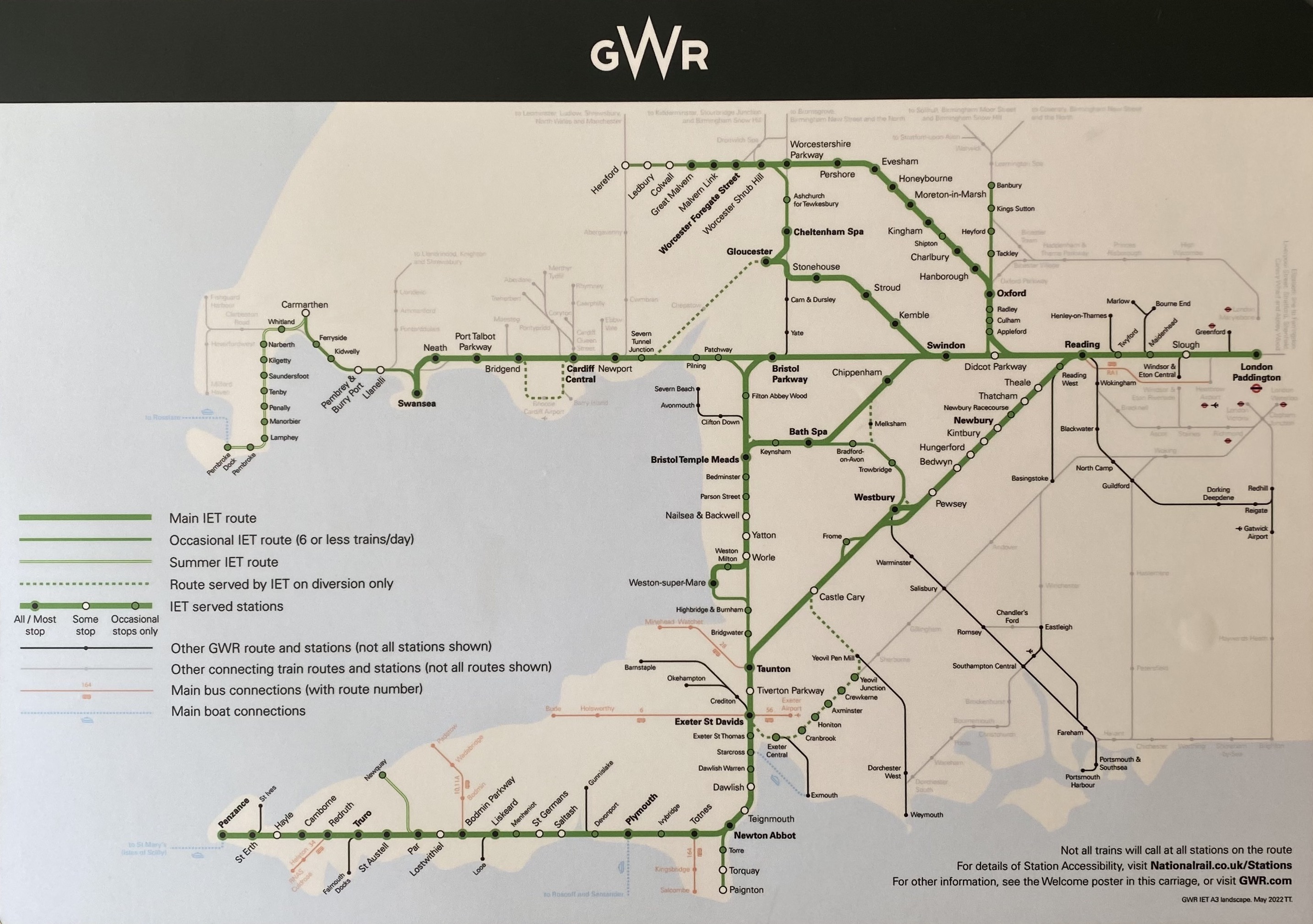
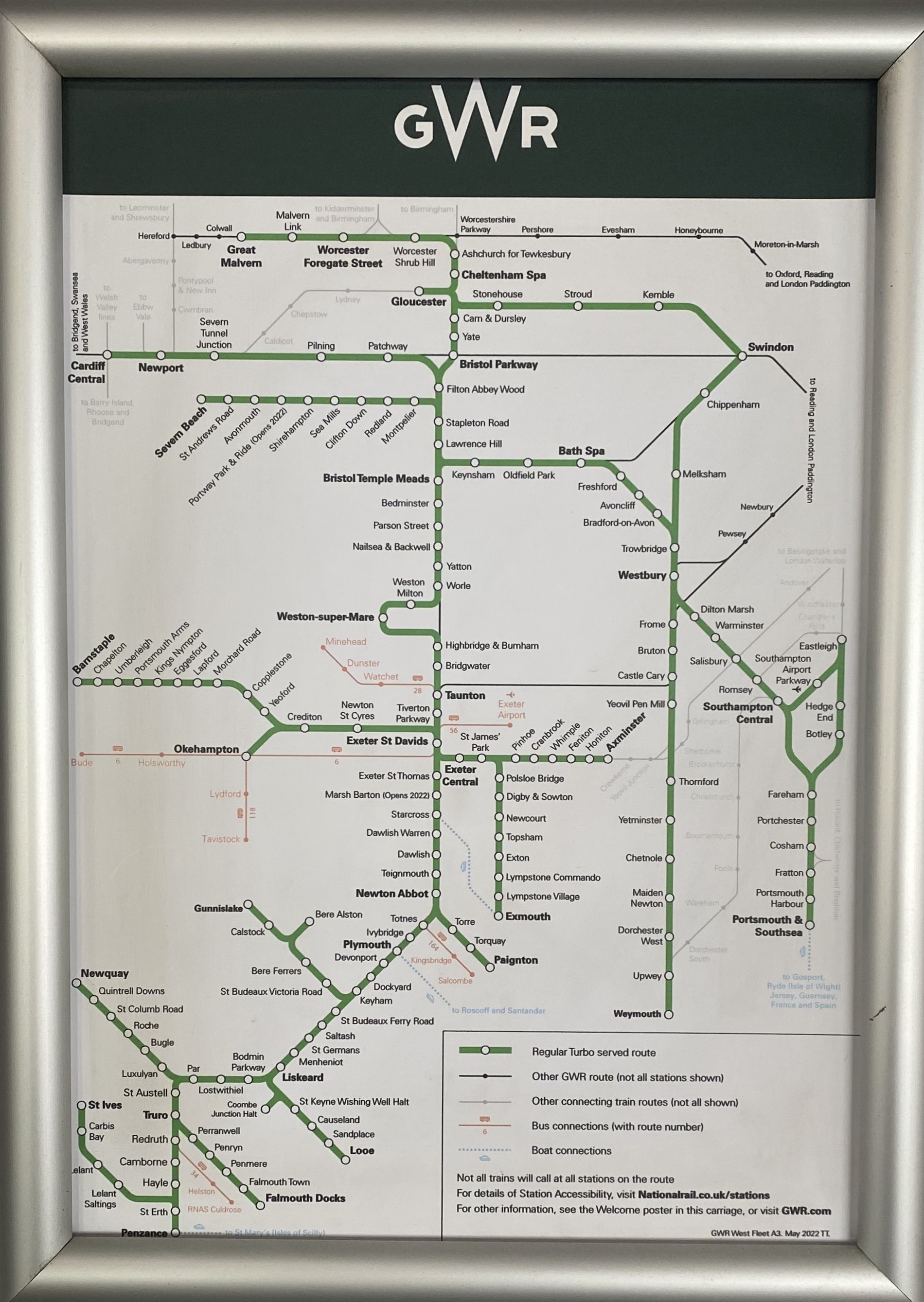
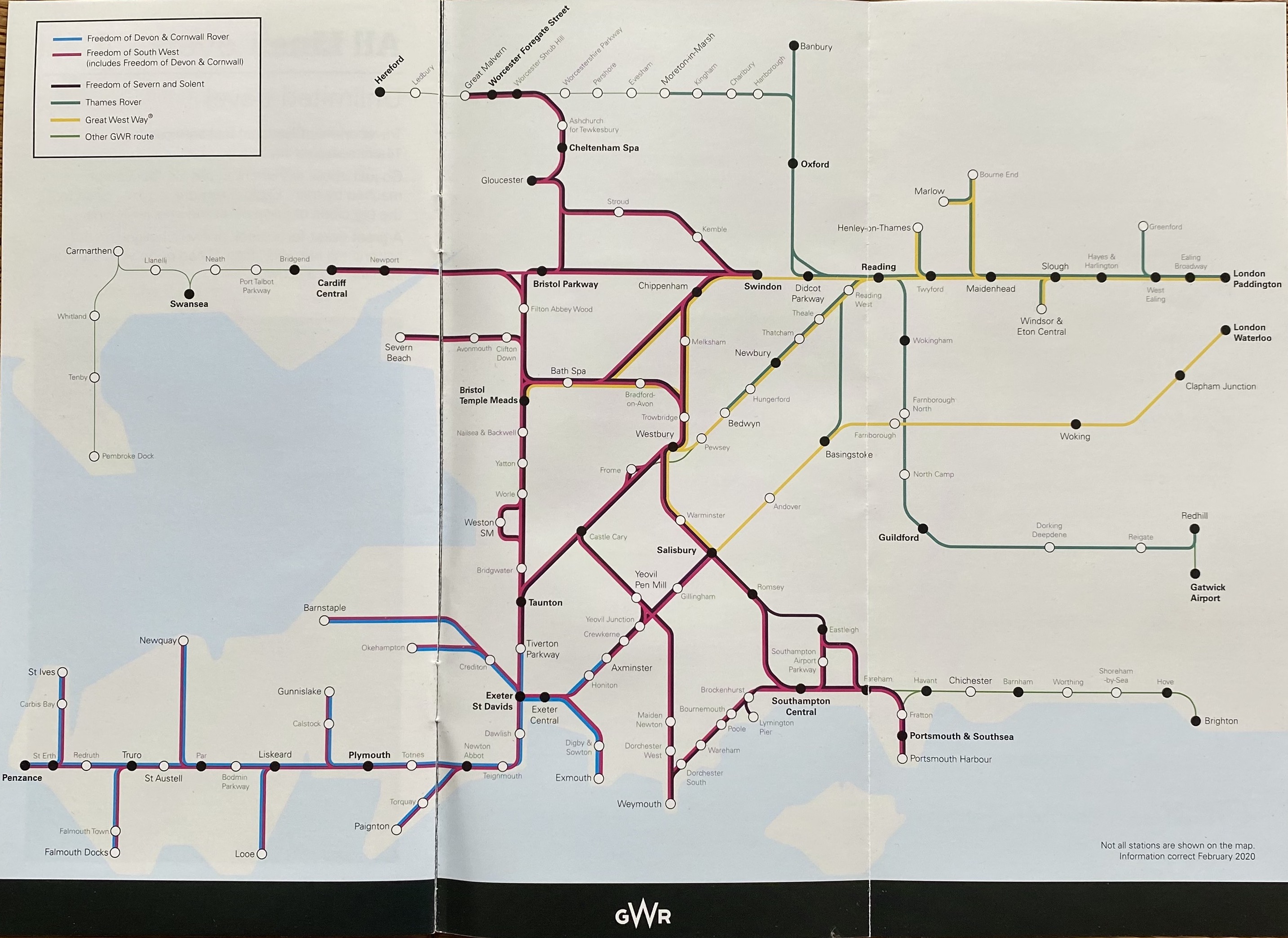
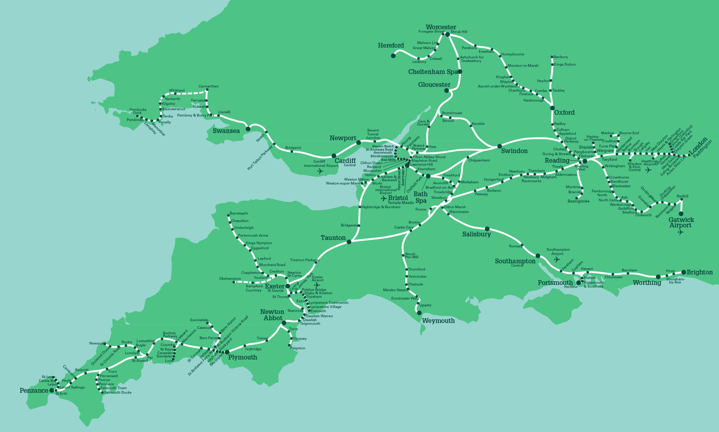
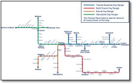
• Doesn't include main line to London |
||||||||
• Looe branch branches wrongly at Liskeard |
|||||||||||||
 |
1.png) |
||||||||||||
 |
|||||||||||||
 |
 |
||||||||||||||||||||||||||||||||||
 |
|||||||||||||||||||||||||||||||||||
 |
|||||||||||||||||||||||||||||||||||
 |
|||||||||||||||||||||||||||||||||||
 |
|||||||||||||||||||||||||||||||||||
 |
|||||||||||||||||||||||||||||||||||
 |
|||||||||||||||||||||||||||||||||||
 |
|||||||||||||||||||||||||||||||||||
Back to geographic realism! |
|||||||||||||||||||||||||||||||||||
 |
 |
||||||||||||||||||||||||||||||||||
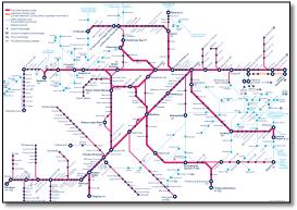
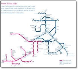
This 'regional' map (whatever that means) only seems available in Flash, so the screen grab here is of poor quality. However the two enlargements show the incredibly poor cartography - captions running over symbols.. |
|||||||||||||||||||||||||||||||||||
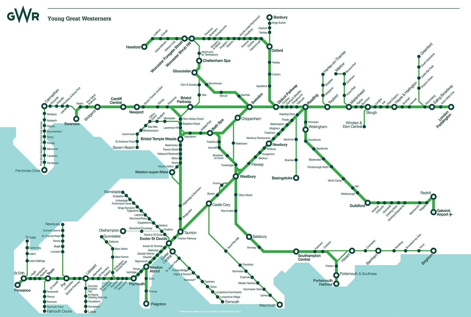
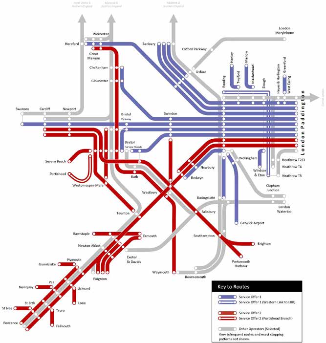
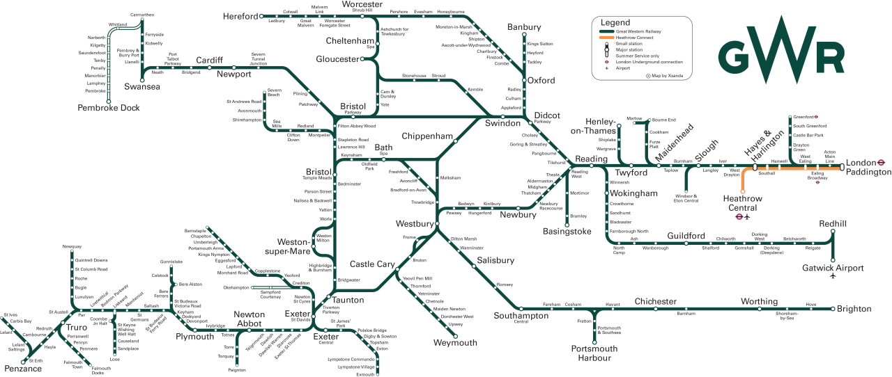
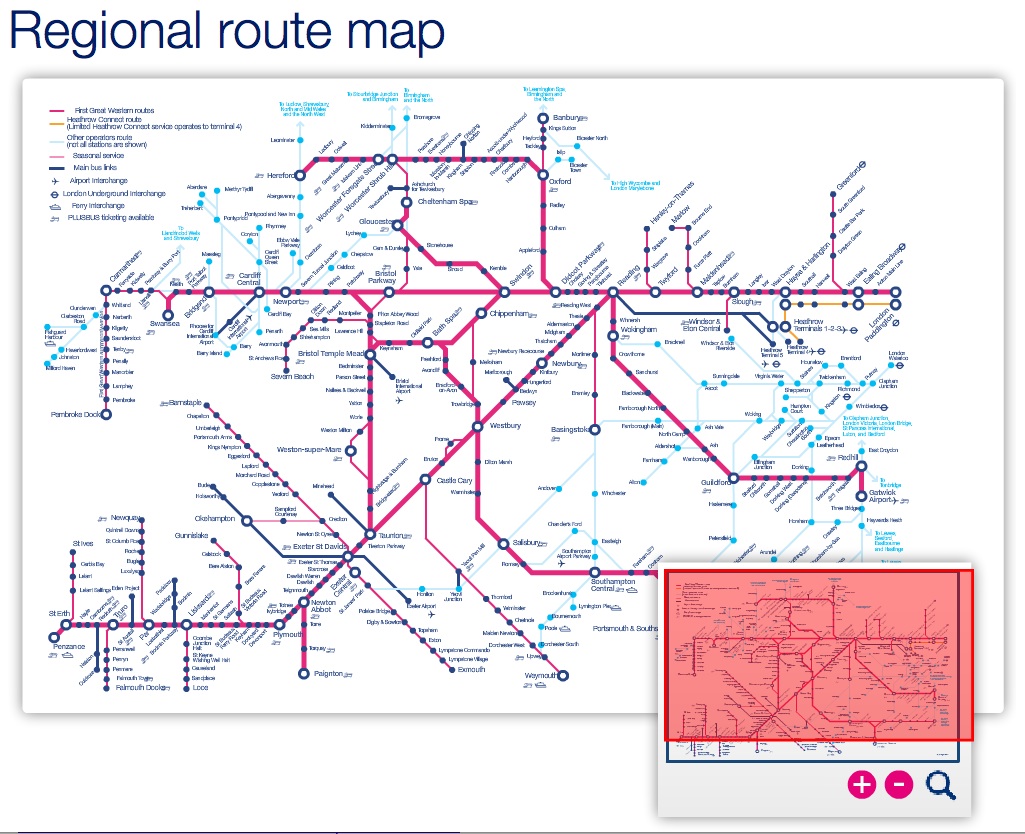
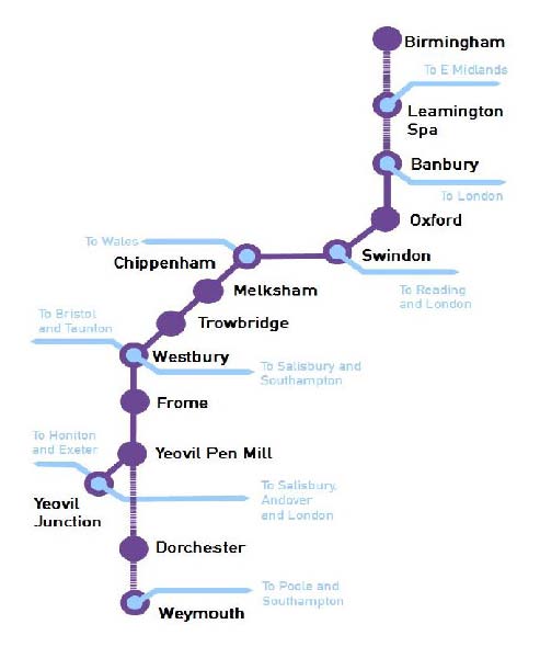
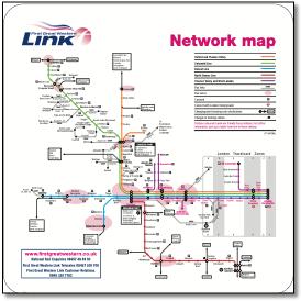
Well, is this the perfect map? Or is it virtually useless? Is it a neat grid-based design, Manhattan, an electronic circuit board or the design for a hot and cold water system? The former, the perfect map, as many designers have tried to reduce the number of angles in pursuit of the simplest design. This demonstrates the desire on the part of the designer to use simple shapes which can evolve into abstract shapes far removed from the geographic reality, for example the perfect circles or ovals found in the Moscow and Tokyo metro maps. This may or may not give the map readability, character or individuality - but certainly shows the drive of the designer to stamp form on what looks random. The later, virtually useless, as the map is unrecognisable as the west and south-west corner of the United Kingdom, particularly as there is no coastline. Is the distortion too much to bear? OK, so it has got every station on it and every connecting bus service, so is a useful reference tool. But does it help you understand how the network works or help you plan a journey? Grid Forcing the network into straight horizontal or vertical lines means that whilst the Paddington to Carmarthen South Wales main line is straight, the West of England main line to Penzance is quite giddy with eight right angled bends. But the winning route is the slightly obscure Swindon to Weymouth line, a direct north - south line that looks eminently doable. Thee map seems to be centred on Pewsey with the four vertical lines either side equally spaced, a nice touch. Stations The large station circle would seem to indicate important stations rather than interchange stations (as is generally the convention) and is used at the end of every line including bus routes. Buses have separate circles at interchange points except at Cardiff Airport and Oakhampton. Use of three point sizes enables small stations to be squeezed in but are not very readable unless the map is seen as a poster. Junctions All lines correctly arrive at junctions except when they connect with 'other' routes - at Basingstoke, Southampton, Guildford, Hereford, Salisbury. Doesn't show station reversal at Gloucester. Routes Selection of routes of other operators peters out as you get close to London, so it's a bit odd showing the two Effingham Junction routes. I'm unsure why the Chiltern Trains route into London from Banbury is identified as this is a competitor. Perhaps more thought should be given to encouraging travel to and from other operators destinations, particularly to the Midlands, the north and into East Sussex and Kent. Doesn't say that not all stations are shown on other operators routes. This map shouldn't be a difficult map to design as most routes are radial from London and it doesn't really have a secondary radial conurbation (apart from Bristol), but it should attempt to show that the lines to Brighton and Worcester from Bristol are of a more local nature and part of the franchise. Having taken the map apart I have to confess to liking it. The designer has thrown away the rule book and produced a stylish map. I want a poster of it. Flipped left to right. With all the stations names in Vogon. Unfortunate that it has been replaced on the website in 2009 but the older version, top right, |
|||||||||||||||||||||||||||||||||||
 |
|||||||||||||||||||||||||||||||||||
 |
 |
||||||||||||||||||||||||||||||||||
 |
|||||||||||||||||||||||||||||||||||
 |
|||||||||||||||||||||||||||||||||||
 |
|||||||||||||||||||||||||||||||||||
 |
|||||||||||||||||||||||||||||||||||
 |
|||||||||||||||||||||||||||||||||||
 |
|||||||||||||||||||||||||||||||||||
 |
|||||||||||||||||||||||||||||||||||
 |
|||||||||||||||||||||||||||||||||||
 |
|||||||||||||||||||||||||||||||||||
.png) |
|||||||||||||||||||||||||||||||||||
 |
|||||||||||||||||||||||||||||||||||